Wednesday, July 6, 2016

Birthday Wishes

Hello crafty friends and visitors! My twins are turning 18 next week, and I've made a birthday card for my daughter that I would like to share with you today. This is my version of a CAS card, but loaded with mixed media techniques and texture. In some photos, like the one below, the card appears more on the bluer side, but it is shades of purple in real life. I took some of the photos under my OTT light, which makes the blues come out, and some were taken outdoors early this morning, before it got too hot.  Rather than go out again and drip sweat all over my card (it's 110 degrees heat index here), we'll just have to deal with the bluer version for some of the shots.

 I made this card purple, not because my daughter loves purple (now), but because my Mom (Grandma to my daughter) loves purple. Everything my daughter has ever made for or given her Grandma is purple. For several years she also declared her own favorite color to be purple, because it is Grandma's favorite. My Mom has also convinced me to love purple!


I didn't take any process shots, but I am listing the steps I took more for my own records than anything, so feel free to skip through. Products used: Media: Distress paint in Shaded Lilac, Wilted Violet and Chipped Sapphire, white acrylic paint, guache-purple, Distress Spray stain in Wilted Violet, Golden Crackle paste, water, rubbing alcohol, Liquid Pearls. Dies: Tim Holtz Butterfly Duo and Handwritten Celebrate, Paper Artist Lacy Rectangle.  Other: Recollections damask stencil, Ranger manila card stock, white card stock.

BACKGROUND
1. Cut Ranger manila cardstock to size.
2. Apply Golden crackle paste through Recollections damask stencil and let dry.
3. Apply Distress paints to craft mat side by side and spritz with water until the colors bead up. I used Shaded Lilac, Wilted Violet and Chipped Sapphire(very little).
4. Drag card through puddle and spritz card with water to blend.
5. Dry and repeat until happy with the look.
6. Apply guache in purple to craft mat and spritz with water for a puddle. Splash  on card and spritz with water to blend. Repeat until happy with color.
7. Dry
8. Remove nozzle from Wilted Violet spray stain and touch to edges of card. Spritz with water to get it to bleed down.
9. Dry
10. Gently sponge Wilted Violet Distress paint over raised damask pattern and around edges of card.
11. Adhere to white distressed card backing.

MASTERBOARD FOR BACKING, FRAME, BUTTERFLY, SENTIMENT
1. Coat white card with gesso; dry.
2. Apply Wilted Violet and Shaded Lilac to card.
3. While paint is still wet, flick with alcohol, trying not to overlap wet areas if possible. The alcohol will make the paint spread out and create larger circles giving an organic look. You will get different effects with different substrates. (Country View: I have circles; they just may not be noticeable to the naked eye! Some are barely visible on the bottom most layer under the damask layer in the shot below.) Dry with a heat tool.
4. I did splatter some watered down white acrylic paint on the butterfly before embossing.


I used a special technique on the second layer of the butterfly, but I will save that for another post. It just didn't have the impact I was looking for on this particular card, so it got used for "fill".


 Well, that was relatively short compared to my usual lengthy posts! Here's one more shot of the card before we go!


I made my card especially for my daughter with these challenges in mind:
Scrapy Land Challenge #45-Anything Goes Dies by Sizzix and Paper Artist.
Frilly and Funkie-All in the Family Keeping the love of purple all in the family and celebrating a family member's birthday!
Country View July Challenge-Have Fun With Circles I know you may not be able to see my circles clearly, but please see my explanation in bold text above. There are also tiny circles formed by the paint splatter and Liquid Pearls.
Southern Ridge Trading Company-Anything Summer My kiddos celebrate their summer birthdays, and I've made one card so far.  Butterflies remind me of summer.
Mod Squad Lazy Days of Summer My kiddos have their birthday this month in the summer. This is a birthday card for my daughter. butterflies also remind me of summer.

Thank you for your visit today and for all of your lovely comments. I read and appreciate each and every one of them!
Hugs and Blessings!
Sara Emily

Tuesday, July 5, 2016

Anything But Cute Challenge #15--Summertime Fun

 Hello crafty friends and visitors! It's time for our next new challenge at  Anything But Cute,  and our lovely hostess this month is the mega talented Anne. She chose the theme "Summertime Fun", and I'll tell you a little more about that in a minute. When I think of summertime fun, my mind immediately turns to the tucked away place in West Virginia  where our family stays every summer.  So here is my second art journal page I've ever made depicting a warm summer day at Capon Springs.


Anne says  "What does Summertime fun mean to you? Spending time by the seaside, foreign travel, camping in the great outdoors or simply enjoying time in the garden? Create a MIXED MEDIA project focusing on how you like to spend your Summertime. Don't forget to tell us how your project relates to our theme."

 Arriving at Capon Springs, you feel life become simpler; there's limited Internet and TV, no locks on the doors, and three meals a day are served family style in the huge dining room. No alarm clocks or even watches are needed, because every meal is announced with beautiful music coming from the trees!  Kids are free (and safe) to roam the pastoral grounds, and you never have to get in your car if you don't want to. Nature is all around you, and on any evening you can sit on your porch and watch the deer out for their evening meal. There are meadows filled with wildflowers and even a forest of Christmas trees with a trail winding through.  Did I mention--no air conditioning except in the dining room and public areas of the main house? Ugg-nothing is perfect! Lucky we're nestled in the mountains in this idyllic setting!

Onto my journal page:  I started by applying gesso to the upper portion of my journal pages and let that dry. Next, I sprayed Dylusions sprays in blues and greens all over the pages.  I used Fresh Lime, Cut Grass, Vibrant Turquoise and London Blue.  I allowed the sprays to dry, and then spritzed, dribbled and flicked water over the pages, taking care not to get the water drops too close together. In some areas I dragged an art comb through the inky puddles made by the water to create texture. You can see where I did this on the right hand side to create the illusion of trees on the horizon (or at least that's what I was trying to do). I also stamped a few Tim Holtz trees in Archival Library Green.

I flicked on Dylusions White Linen spray with a paint brush straight from the bottle to get the tiniest droplets, and added DecoArt Titanium White with a crumpled up piece of Saran Wrap randomly over the page.  I stamped and fussy cut the dragonfly (Stampin' Up) on Tim's plain tissue wrap in Archival and colored the wings with Perfect Pearls powder. I curled the wings and adhered just the body.


In the "meadow" I did some stamping and heat embossing (Tim Holtz and Stampin' Up) for weeds and wildflowers. I also stenciled some wildflowers using a TCW stencil and texture paste.  While the paste was wet, I added white embossing powder, and when dry, heat embossed. I added some shadows using a black watercolor pencil and my water pen.


In the photo below, you see the "mountains" in the background, made simply by spraying  turquoise spray in the green area and tipping the page to form the peaks. The gesso gives it an entirely different look.


I tried to get a shot of the iridescent embossing powder I used on the texture pasted dragonfly (same TCW stencil), but  the photo is rather blurry, and as usual, the sparkle is being camera shy. You might be able to pick up a tiny bit of shimmer in the background here, too. I picked up the Perfect Pearls instead of the intended Dylusions spray at first. I wiped away as much as I could, but just a tiny bit of shimmer tells on my mistake. Since I only sprayed the gessoed portion with the Perfect Pearls, it gives the sky that summertime shimmer you often see when it's hot.


My lone butterfly is from Happy Little Stampers, and I colored her with Distress inks and markers in Tumbled Glass and Wilted Violet. I stamped two and fussy cut them; the top one I eliminated the back wing and popped up the front wing with a foam square. The dimension is seen better in the photo above. The "weeds" remind me a little of fireworks, and so I will say that is part of the summer fun, as well. It would not be the 4th of July (my favorite summer holiday) without fireworks!


I heat embossed one of Tim's coneflowers on the paper I lined my spray box with, so after fussy cutting it, it blends in real nice. I decided to use it instead of stamping directly on the page (chicken!). I decided to stamp my Tim Holtz quote on a "board" that balances out the frame. I made this and the frame by painting my card with baby blue acrylic paint, coating with DecoArt Weathered Wood. Once fully dry, I gave it a coat of Titanium White (DecoArt) and then DecoArt Crackle Glaze. I defined the cracks with DecoArt Raw Umber Antiquing Cream, distressed and inked the edges with Ground Expresso. I stamped the quote in Timber Brown Staz On.


And here's what it's all about at Capon--the porch of the West Virginia (buildings are named)--where we meet friends from various states for our annual "Capon Family" reunion.  There are four families-- all unrelated, including ours that have stayed the same week of the year since our kids were babies, so they are like real family. We stay in the same rooms of "our house" year after year, and in the evenings after all the fun of the day we sit in our chairs on the porch and play games and catch up.  On rainy days, you can find us on the porch playing a variety of games. We have 8 teenagers/young adults between us, and they bring their Capon friends to "our house" to play along.  "Team West Virginia" gets together over the week to hike, run, play golf, swim, go horseback riding, and my favorite -- go on a week long scavenger hunt called Caponchase.  We usually win; we are a competitive and pretty bright bunch! Among us we have a history professor, a retired history teacher, a middle school teacher, a nephrology nurse, an attorney, an architect, a medical doctor (poor Cathy always gets called on for the inevitable Capon injuries) and a retired physical therapist assistant, so we can usually solve any puzzle you give us.

I used my new Tim Holtz Ornate Frame--I admired all the great things my blog buddie and teammate, Autumn of Sew Paper Paint has done with her's, and it moved to the top of my wish list.  If you have not already visited her at her blog, you must! You will be so inspired! I crackled  and painted it as I did with the sign holding the quote, but reversed the blue and white paint sequence. I'm not sure where that bright blue came from in the photo of the porch, but I thought it looked pretty cool.


Here are a couple of photos of the two pages in full.  I apologize for the long photo heavy post, and my long description of our annual summer trip, but I do get excited about seeing my friends and all the fun we have together for this one special week out of the year. Capon is a very special place, and we have been going at least once a year for 24 years! I have met some of my best friends there!


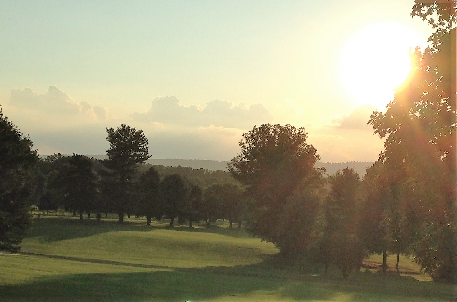
  Here's a view of the 9th fairway on a steamy summer afternoon. Most days there's not a cloud in the sky!


I hope you will visit my teammates blogs to see their amazing summer creations, and when you are done, that you will be inspired to play along with our "Summertime Fun" challenge .

I am sharing this summer art journal page with:
Frilly and Funkie All in the Family this is about my annual family vacation where we meet up with our Capon family.

Thank you for your visit today and for all your lovely comments! I read and appreciate each and every one of them! Please let me know if you have any questions.
Hugs and Blessings!
Sara Emily

Tuesday, June 28, 2016

Pastel Baby Shoe

Hello again! I'm back with my second post today and only have minutes before the Pastels and Pearls challenge at Frilly and Funkie closes. I've had a vision of a baby shoe made into home decor in my head for awhile and really wanted to get 'er done for this challenge.


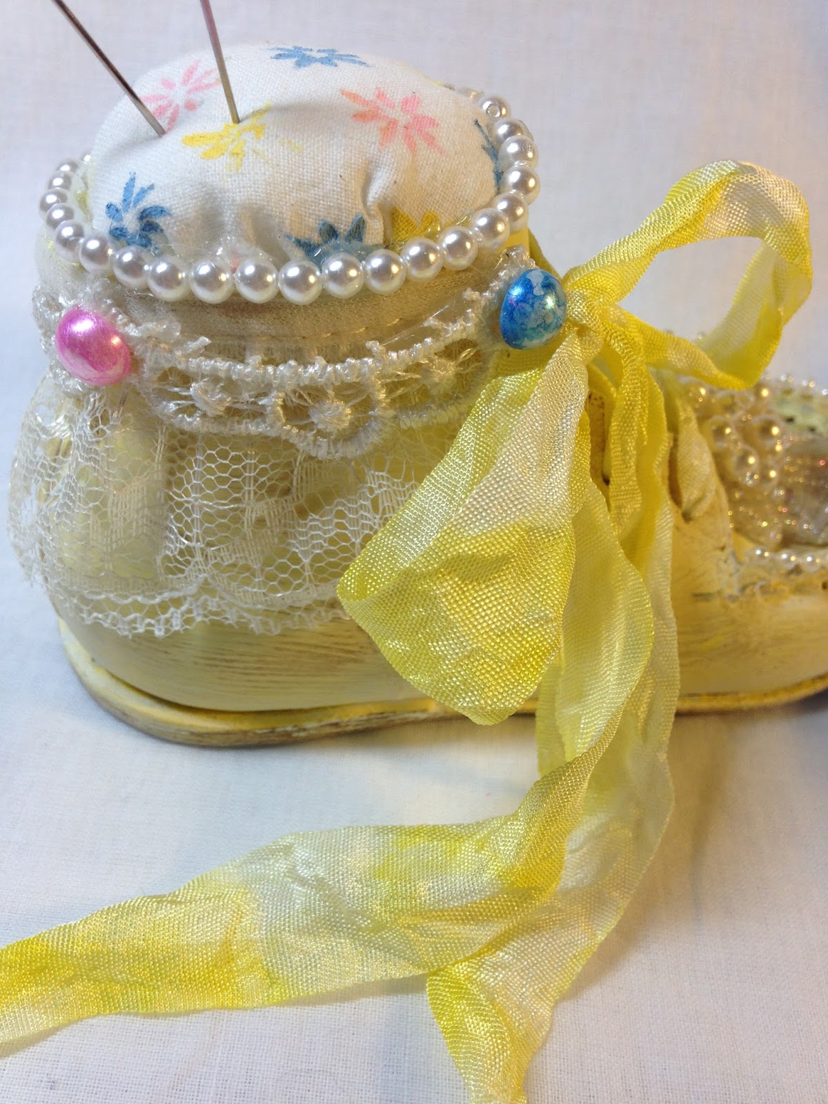
My nephew and his sweet wife are expecting their second baby next month, so I wanted to make them a little pin cushion for the new baby's room. They chose to be surprised and do not know if they will have a boy or girl, so I made a pastel yellow shoe with hints of pink and blue. I tried to be non-partisan and gave equal time to the pink and the blue, but I'd really like them to be blessed with a baby girl! They already have a sweet little boy.

I picked up the shoe at an estate sale last week--the lady must have thought I was crazy for purchasing just the one shoe! If it had a match I would have bought that, too! 

I stenciled the white cotton fabric with a TCW stencil and Distress paint, Spun Sugar, baby blue and buttercup acrylic paints. I quite like how it turned out! 


I gave the shoe a coat of gesso and painted with buttercup yellow acrylic paint. I gave it a wash of Picket Fence Distress paint and wiped it back to make it even more pastel. Lastly, I wanted a vintage look, so I scuffed it using DecoArt Antiquing cream. I added layers of lace and pearls from my stash.  The pink half pearls were colored with Liquid Pearls and the blue with Sailboat Blue and the white mixative alcohol inks. The pins are from my stash--the pink was already--well-- pink, and the blue was painted like the half pearls.


Crinkle ribbon was colored with Distress ink in Squeezed Lemonade, and the lovely blingy and pearly piece is from my stash.  I believe it started life as an earring.

I hope you like my little altered baby shoe! It was so much fun to make and only took a few hours start to finish.  Most of that time was spent looking for just the right embellishments.  The photo below is not the most flattering of shots, but I am squeezed for time and wanted to include a face on shot. It does look like a face, doesn't it?! Oh, my! I think I need some sleep!

Thank you to Nancy at Frilly and Funkie for the inspiring challenge! I wouldn't have thought to make this cute little piece of home decor without her challenge and the wonderful inspiration from all the talented Frilly and Funkie girls on the Design Team.


I'm sharing this with...

Thank you for stopping back in and for all your lovely comments. I read and appreciate each and every one of them!
Hugs and Blessings!
Sara Emily

UPDATE: Yippee!
   

Monday, June 27, 2016

Keys to My Heart

Hello friends and visitors! I hope you've been finding time to be creative!  I've turned my back on my paper and card stock and made my project mainly out of metal. Here are the keys to my heart (rust, metal, grunge).


It's hard to tell which is the front and which is the back, so I'll show both and let you decide. I really should stop making 3D projects, because they are so hard to photograph, and I must bore you with so many photos. As you might be able to tell, it was raining (finally) when I took these. I had to take the shots outside, because the light in my studio reflects off all the metal.


I'm sorry I've got no process shots, but I'll make up for it in close ups. I started with aluminum foil and masking tape to form my heart. I cut up pieces of  air conditioner's/plumber's tape and embossed them with a Lifestyle Crafts embossing folder. I used these pieces to cover the heart and colored the heart with a variety of alcohol inks. I gave it a coat of Black Soot Distress paint and before it was fully dried, I wiped most off to leave it in the recesses. I heat embossed with my beloved Burnt Copper Leaves embossing powder randomly (sold at Emerald Creek Craft Supplies--I can't locate a link). See all those nice metallic bubbles? That's the powder heated slightly; when you heat it longer it forms a nice smooth enamel--not the look I was going for on this project.


This entire project was inspired by a box of keys I picked up at my neighbor Hilda's house when it was being cleaned out following her unfortunate passing earlier this year. Many of the keys have unique shapes, but  are not especially old, so I aged them and a metal keyhole embellishment from my stash with black gesso, DecoArt Sand Texture paste and media paints in Raw Umber, Quinacridone Gold and Cobalt Teal.  I embossed with just a touch of Distress Tea Dye Embossing Powder. I also made a few keys and another  keyhole using air dry clay and a Mod Podge mold. I colored them with Prima Alchemy paint in  Steampunk Copper, Deco Art Raw Umber, Quinacridone Gold, and  just a touch of Cobalt Teal. I was able to bend the metal keyhole and mold the still pliable keys and hole to the heart, but there was no budging those real keys!


See the "nails" on the keyhole and periodically on the upholstery tacks? Those are black half pearls colored with black gesso and watered down Steampunk Copper. I think this just might be my favorite detail.


I bet you wish these close ups weren't so blurry; I know I do! Mr. I wanted to focus on all that foil!


I'm very fortunate to have purchased a very large roll of brass upholstery tacks (well that's what they look like to me) from Hilda's estate sale last year, and these work as a perfect embellishment. I aged them in a similar manner as the keys and adhered them to the heart's edges which was tricky to say the least. Golden glass bead gel adds some rusty grunge to my heart.


And a few more random shots. I assure you, no paper was harmed in the making of my heart!


I am sharing my heart with the following challenges:
Mixed Media World MMW #15 From Scrap to Masterpiece My scraps are keys getting ready to be thrown in the dumpster.
Mixed Media Monthly Challenge #25 2nd Anniversary I chose Texture - November 2015
  

Thank you for stopping by today, hanging in there with me,  and for all your wonderful comments. I read and appreciate each and every one of them! 
Hugs and Blessings!
Sara Emily

Sunday, June 26, 2016

Listen to Your Art

Hello crafty friends and visitors! I had a little mixed media fun in my closet today with a couple of special challenges in mind. Here is my over sized tag using a "practice" journal page torn from my art journal. I ended up not using it for the intended purpose, but thought it was a great start for this tag. Rule #1-NEVER throw anything out! It may just be your next "masterpiece"!


My original project was going to have a sun on it, but I changed my mind and tore out the journal page. Here's how it started as a different project: For the background I gave my card a coat of gesso then spritzed with Dylusions blue sprays while still damp. I immediately spritzed with alcohol and splashed with some water droplets. I let this dry. Next I laid down some texture paste through a Tim Holtz Speckles stencil laid over his Rays stencil. Not at all part of my design plan for this tag, but it gave lots of texture and most would be covered anyway.

This is where I start with the plan for this tag: I chose a few blue guache colors and watered them down. I applied them to the dried tag and spritzed with water to move the color around. I flicked more alcohol and water at it for visual texture and allowed it to all dry.  Watercolor used to be my favorite art medium, but I'm quickly becoming a guache convert.

I added more stenciling using a home made bricks stencil and Distress Picket Fence Crackle Paint.


I splattered with watered down white acrylic paint and added random stamping using a Heidi Swapp musical image. The quote is actually from two separate older Tim Holtz sets--both had the word "heart" in them. The "Listen to your heart" image did not clearly imprint the word "heart", so I borrowed "art" from another "heart" quote.  These were stamped in Archival ink on Tim Holtz plain Tissue Wrap and adhered with Multi Matte Medium. Nearly seamless collaging with that Tissue Wrap! I edged the tag with Frayed Burlap Distress ink and distressed and layered with more card.

The frame is Tim Holtz Ornate Frame covered with Golden Crackle paste, and sprinkled with Holographic and Frantage (sparingly) embossing powders. When the paste was dry, I hit it with my heat tool to melt the powders. The camera barely picked up the sparkle. It's amazingly shimmery in real life! Half pearls in a gold color from my stash. Usually Golden gives the best crackle, but this jar seems to have left out it's crackle--I have yet to see good cracks come from this jar.

I hand cut the tag from heavy watercolor paper and stamped another old Tim Holtz bird image. I used Distress Markers directly on the stamp, spritzed lightly with water and stamped the image for a watercolor look. The musical notes (I hope they look like musical notes) are hand drawn and pearls added. More Frayed Burlap and distressing for the edges.


The two blue flowers are handmade using Tim's Tattered Florals and a lighter weight water color paper I used to mop up the guache paints on my craft mat. I flicked some of the papers with watered down black guache. I'm afraid I've lost some of the variegation of the flower's colors in my lack of photography skills and having to shoot this at night. I gave the white rose and the pebbly stamens a dusting of whatever was on my blending tool--I think Rusty Hinge. All the pearls and other stamens were colored with Butterscotch Alcohol ink to somewhat match the half pearls from my stash. Gold microbeads finish the flowers off. Various die cut foliage added from my scrap pile.


I hope you like my tag! I'm going to share it with the following challenges:
A Vintage Journey Texture or Embossing Paste I used texture paste on the background (not the bricks) and Crackle embossing paste on the frame.
Mixed Media World MMW #15- From Scrap to Masterpiece My tag was created from a torn out journal page that didn't go right the first time around.
Mod Squad Challenge All That Glitters I used glittery embossing powders on my frame.


Thank you for your visit today and for all your lovely comments! I read and appreciate each one of them!
Hugs and Blessings!
Sara Emily

UPDATE: Yippee! I was a Top Pick at Country View!