Saturday, February 27, 2016

Rusted Reality

Hello, friends!  I have a card to share with you today. I was playing around with my embossing powders and paints and just generally trying this and that. Even though Valentine's Day has come and gone, I couldn't resist using those romantic colors once again.


I started with a cardboard base--the backing of a discarded steno pad.  Did anyone else take stenography in school? I guess I'm dating myself by asking that, but I still use these paper notebooks to write everything down.  I have one for every aspect of my life; I guess they would be an un-glorified diary. I digress...

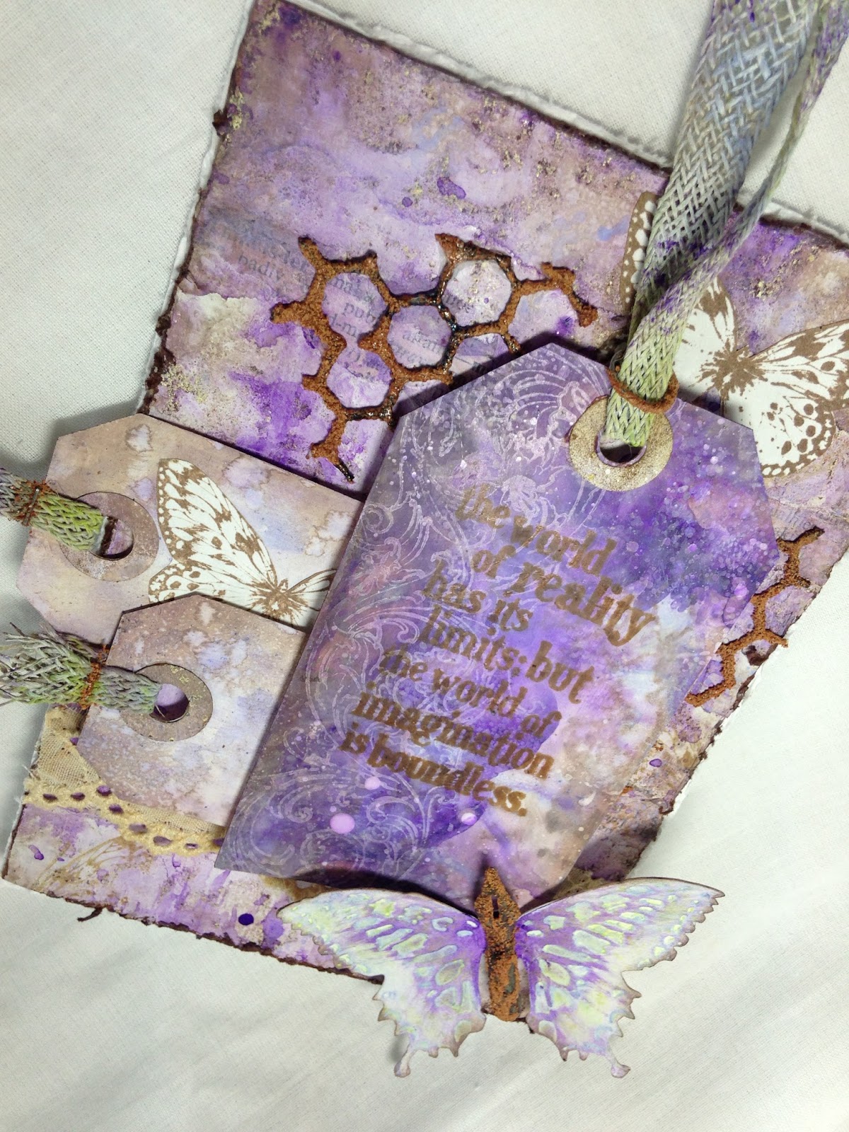
I found a sheet of brown cardstock which I had embossed with a Recollections damask stamp and Antique Linen Distress powder. It didn't emboss well, but I thought I might have a use for it some day. Today was that day.  I tore it into strips which I layered on the board. I gave it a coat of gesso using a credit card and then scraped over it with the card before it completely dried. This gives a nice worn texture, and the gritty embossed areas show through. Next I layered with some strips of vintage book pages randomly and gave them a wash of watery gesso.


I dabbed some distress paints in Shaded Lilac and Wilted Violet and teensy bit of Chipped Sapphire in different areas of my craft mat, spritzed with water, and dragged my card through the puddles, spritzing with water to allow it to drip and blend, then drying and repeating until I came up with what appealed to me.  I love it when the paint is reduced to just dots of color.  I turned my card face down into those drops to get these lovely droplets on the background.  When completely dried, I distressed the edges and blended with Ground Expresso. Finally I stamped randomly with a Kaisercraft butterfly in Potting Soil Archival ink.


The larger tag is hand cut and covered first with gesso and dragged through puddles of Distress paints, spritzed to blend and dried.  I repeated until I was happy with the outcome. I stamped with a Tim Holtz flourish in Picket Fence Distress paint. I dried, blended with Ground Expresso ink, and spritz and flicked . Lastly, I splattered with diluted Picket Fence paint. The quote is Tim Holtz stamped in Potting Soil Archival ink.


The two smaller tags are Tim Holtz tiny Tags and Tabs, cut from more paper I colored with Distress inks and paints.  Again I stamped two Kaisercraft butterflies on a separate piece of paper and fussy cut. I adhered one on the tag, and another to peek out from bhind the large tag. The eyelet trim is a gift from my talented and super hilarious friend Niki of Pawsatively Creative Crafts.  Be sure to pop by her blog and see what amazing creative things she has put together--you will be so happy you did and leave with a great big grin on your face!  I stained the trim with some sort of spice tea, and I have to say my Closet smelled wonderful while it was drying.


The rusted chicken wire is Tim Holtz Mixed Media Thinlit embossed with my own mix of  powders and Embossing Puffs. I used the same rusting technique on the jump ring and staples which fasten my hand colored (Distress piant in Twisted Citron, Shaded Lilac, Picket Fence, and Wilted Violet) Linen Ribbon trim on the tags, as well as on the Ideaology pen nib. The pen nib was colored first with Mushroom and Pitch Black alcohol inks.


The die cut butterfly is Tim Holtz Butterfly Duo. Before embossing with the enclosed folder, I dabbed the folder with Twisted Citron Distress paint and spritzed with water. Once embossed, I dabbed the raised areas with Shaded Lilac paint and wiped while it was still wet.  With Wilted Violet paint on a damp baby wipe, I applied it to the body and wiped it out toward the wings. Finally, I edged with Ground Expresso ink.


I hope you enjoy my card as much as I did creating it!  I would like to enter it into the following inspiring challenges:
-Mixed Media Place Creative Gym # 17 Coffee I used tea to die the trim, and perhaps a little Ground Expresso counts too! :)
-Vintage Stamping Challenges # 41 Splatters and Drips See bold text for splatters and drips. My stamps include those by Tim Holtz and Kaisercraft.
Mixed Media World MMW # 11 Love is in the Air I was inspired by Georgie's make--although there's no mention of love in either project, we both used colors associated with romance and love. And I do love butterflies and rust!

Thank you for stopping by today, and for all your amazing comments!  I read and appreciate each one of them!
Hugs and Blessings!
Sara Emily

Tuesday, February 23, 2016

Spring...

Hello again, crafty friends!  I hope you are doing well and that you might be seeing some signs of spring where you are!  We are seeing daffodils blooming, purple blossoms on the magnolia trees, greening grass and bluebirds! Sure signs that spring is right around the corner!  These things inspired me to make a little spring card full of blue skies, blooms and butterflies!


My blue sky background is colored with Dylusions sprays in Vibrant Turquoise, London Blue, and White Linen and water color paper. I topped that with a French Lattice die from Cherry Lynn, some handmade flowers and little fluttering butterflies.

The two delicate white  handmade blossoms are a gift from my sweet, generous, and hugely talented friend Samra of Paper Talk with Samra!  Aren't they lovely? Thank you, Samra--I really love playing with my stash of Samra blooms!  Please be sure to pay Samra a visit at her lovely blog soon for a real treat!  She works magic with Shabby Chic and is a real inspiration to me!  The two larger roses (well, they are supposed to be roses!) are made using Tim Holtz Tattered Florals and given just a hint of color with Distress ink in Tumbled Glass. The whimsical flower spray is Memory Box Chloe Stem with some added bling. The leaves are cut from Tattered Lace Ornate Leaves and colored with Perfect Pearls Spray Mist in Sour Apple. This adds just a hint of shimmer in real life.


My butterflies were cut from hand colored paper and Tim Holtz Butterfly Flight die.  A real bugger to cut, because my paper was really too thick with all the medium applied.  I started with watercolor paper, sprayed with Dylusions Bubblegum Pink, textured with a Tim Holtz Dot Fade stencil and texture paste, and colored again with Lumin Arte Silks Acrylic Glaze in Boysenberry. Because there is mica in the paint, these little flutters really catch the light in real life.

I added a stamped sentiment from Stampin' Up, inked in Watering Can Archival, and blended with Tumbled Glass.  It is framed with Spellbinders Twisted Metal Tags and Accents, which I edged with Tumbled Glass and added some bling. My crinkly bow is made from my vintage seam binding colored with Silks Glaze in Jasmine.


I would like to enter my card into the following inspiring challenges:
Scrapy Land Challenge # 36 Tie One On (include a bow-die cut or ribbon) I used the following brands of dies:  Cherry Lynn, Tattered Lace, Sizzix, Memory Box, and Spellbinders.
Happy Little Stampers February Mixed Media Challenge Paint I used paint on my butterflies and bow. One stamp-sentiment.
Simon Says Stamp Wednesday Challenge Shake It Up! I shook up my Dylusions sprays to get my blue sky and snappy butterflies and Perfect Pearls to get some shimmer!
Simon Says Stamp Monday Challenge Inspired By a Song I was humming 'What a Wonderful World' by Louis Armstrong the entire time I was making this card recalling these verses:  (I didn't see where we had to include the words on our project.)

"I see trees of green, red roses too
I see them bloom for me and you
And I think to myself
What a wonderful world
I see skies of blue and clouds of white
The bright blessed day and the dark sacred night
And I think to myself
What a wonderful world"

Thank you for stopping in today, and for all your lovely comments! I read and truly appreciate each and every one of them!
Hugs and Blessings!
Sara Emily

Saturday, February 20, 2016

12 Tags of 2016-February

Hello friends! I'm here to share with you my second tag of the year for Tim Holtz' 12 Tags of 2016. If you saw my last super grungy Tim Holtz inspired post, you would understand this is a complete shift from my comfort zone--so fluffy, delicate and PINK! But I have to say, I'm starting to feel quite happy making pink, soft things as well. I hope you like my version!


I will direct you to Tim's blog where you can learn from the master the "how" behind this month's Technique Remix--combining Monoprint and Embossed Texture Paste.

2016TAG

I kept my embellishments simple, because I had a busy background.   How fun it was to make that wee little flower! And to make it extra fun,  the script on my heart is upside down! That tiny print is so hard to see on the perfectly scaled Motif paper before it's revealed with Distress inks--should have inked before cutting! I added just a hint of color to my Photobooth--the flush of love on this young couple's faces, a hint of Tumbled Glass on the young gent's shirt, and a little Shaded Lilac dress! Oh, of course, some Worn Lipstick, because they've kissed it off!


Dies: Tim Holtz Sizzix Flower Garland and Heartfelt  Stencils: Tim Holtz Gothic (Monoprint), Valentine (Texture Paste), and Flourish (bumped with ink and marker)    Ink: Distress in Shaded Lilac, Spun Sugar, Picked Raspberries, Hickory Smoke, Ground Expresso, Tumbled Glass, Vintage Photo;  Archival in Potting Soil   Paint: Distress Picket Fence   Marker: Distress Picket Fence   Embossing Powder: Ranger silver  (High, Ho! Silver, away!)  Paper: Tim Holtz Motif Paper Stash and Ranger Manila card stock           

That's it for today!  I am enjoying re-mixing these techniques; what a fun challenge, Tim!

I would like to enter my tag in the following inspiring challenges:
Stamps and Stencils Splatter, Spritz, and Smoosh I spritzed my inks with water on my stencil, smooshed the stencil onto my card, and in the end, splattered with a little Picket Fence Distress paint.
Card and Scrap Challenge #112 Layers My layers are visual layers only, using inks and markers to layer on color.

Thank you for stopping by today and for all your encouraging comments!  I read and appreciate each and every one!
Hugs and Blessings!
Sara Emily

Thursday, February 18, 2016

Guest Designer For A Vintage Journey-Stay Curious...

Hello crafty friends! OOPS I'm a little late!  Blogger didn't go off! I am so delighted to be invited to be Guest Creative Guide at A Vintage Journey again! It is such an honor to create along side the amazingly talented Creative Guides. Tracey's  "Industrial" challenge this month is perfect for me, because I love a good vintage grunge project. I decided to step out of  the strict vintage steampunk look, by including some very current stencil work on my piece.


I started by cutting a piece of foam core to size and covering it with plain kraft colored tissue paper. I inked it with Ground Expresso to deepen it a little, and added texture paste through a DecoArt stencil.  While the paste was still wet. I added one of my own custom blend embossing powders I've been playing with. I heat dried, allowing it to bubble up just a bit. The finished  product reminded me of a motherboard gone Steampunk.


For my next layer, I cut and distressed a piece of corrugated board and painted it with Folkart Metallic Gunmetal Grey.  Next, I added some embossing with brown embossing puffs, and another of my embossing powder blends. I was inspired to make this after watching an episode of American Pickers, and Mike was interviewing in front of an old rusted tin roofed barn. Inspiration comes from the strangest sources! Following that, I selected 3 tags and covered them with my 3M metallic repair tape, and punched the holes. I embossed them with Tim Holtz steamy Texture Fades and added some color using the alcohol inks shown. I sanded the tags and added more color: Copper alcohol ink Mixative and Distress paints in Antiqued Bronzeand Black Soot. The paints were applied, dried with a heat gun a little, and wiped off to leave an old industrial look. I added yet more texture by embossing with some of my specially blended powders, which gives these a real greasy look. I may be the oddest female on earth, because I love the smell of old engine oil-- I think it was my upbringing watching my brother restore old cars.


 The first tag was embossed with an Artful Muse Texture Fade and I added a Small Talk sticker edged with chalk ink.


The second tag was embossed with the same TF, but I mixed it up a bit.  I inked up a Tim Holtz Phrases 2 stamp in chalk ink for the quote and stapled it on with Tim's Tiny Attacher.


The last tag was embossed with the Steampunk Texture Fade and again, I chose some appropriate Small Talk. I attached a length of various chains from my stash to the tags to finish my piece.


I want to thank the girls at A Vintage Journey for inviting me to play along today, and I want to extend a special thank you to Nikki of Addicted to Art for her inspiration!  Perhaps you recognize the design--I am privileged to admire Nikki's artwork every day I go into my Closet, because "I Imagine, I Believe, I Create" sits front and center of my workspace. Thank you Nikki, for your lovely gift and for your amazing inspiration!

I would like to enter this into the following inspiring challenges:

Saturday, February 13, 2016

Mother(board) Love

Happy Valentine's Day to all those that are celebrating it! I've made my final card; this one for my son, who is big into computers.  Pretty simple, but that's how he likes things.


I started with a Tim Holtz water color card, using the smooth side.  I used my heart diffuser as a stamp to make the central heart. I sprayed the heart portion of the diffuser with Evergreen Bough and Rusty Hinge Distress spray and then with water and then stamped it on my card.  I dried with a heat tool and again sprayed the heart and repeated as above around the rest of the card, spritzing with water to blend, drying between each  stamping. Here are a few in process shots.  I also splattered some spray on my  craft mat and mopped up the droplets for a little visual texture on the background.


I made a stencil by tracing around the diffuser heart, laid this over the panel and used texture paste and a DecoArt stencil (smoosh) to make the motherboard pattern.  While the paste was wet, I added Ranger copper embossing powder and heat dried. I wanted to give the heart more definition, so I glued a fine gauge copper wire around the perimeter.  That was fun! NOT!

I didn't like the little empty spot in the upper left part of the heart, so I added a Remnant Rub. A simple Ideaology tag, colored with Cracked Pistachio Distress Paint, a tiny brad embossed in copper to match, and a few letters from Tim Holtz' Label Letters  finish off this simple one layer card. I edged the card blank in Versamark ink and heat embossed with the copper.  I think my son will appreciate it.


I would like to enter my simple card in the following inspiring challenges:

A Vintage Journey February Challenge- Industrial My Tim influence is with the sentiments.
Frilly and Funkie-Love is in the Air! I think my colors gives this a vintage look, but it is definitely contemporary, too!

Thank you for stopping by today and for all your amazing comments!  I really do appreciate them!
Hugs and Blessings!
Sara Emily