Tuesday, June 23, 2015

Tim's 12 Tags of 2015-June I Thank My Lucky Stars

Hello friends!

Today, I'm celebrating! I've just completed 8 months straight creating for Tim's 12 Tags Challenges.    I'm also celebrating  the fact that I've finished my June tag for Tim Holtz 12 Tags of 2015-June early! And you can bet I wrestled with this one, as I had only a few of the products, and it was difficult to find appropriate substitutes.  Please read and see here to see how the Master of Creativity, Mr. Holtz made his tag.


Here is what Tim's inspirational tag looks like:


I did have the Typed Tokens, the Tiny Attacher and Mirrored Stars, tag, paints and inks, but aside from that, I had to improvise.  After trying every one of my seemingly appropriate Layering Stencils to make a similar background, I settled on using a Sizzix embossing folder, which I inked up with my Distress minis, Peeled Paint, Forest Moss and Mowed Lawn, and used like a stamp. I was very pleased with how it turned out.

Now, I've got my weight in Tim's dies, but NO Fresh Brewed die, so I went with my  two newest additions to my  Tim Holtz die collection: Thinlits Labels and Butterfly Duo. I pretty much followed the technique with the paper piecing, with one small exception.  I added Peeled Paint Distress Paint to the clear waste packaging to high light the butterfly's wings. Picket Fence, Walnut Stain and Peeled Paint Distress paints color the spinner body.


I chose a burlap scrap in a lighter color to match my jute which I colored with coordinating Distress inks.  My sentiment is from Tim's Small Talk, and I added the hashtag.  I colored and curled up some Paper Twine (love this stuff!) using Distress ink. I used Citrus, Meadow and I think Butterscotch alcohol inks to color my stars. (The yellow star was already colored in my stash, so unsure of the color.)


That's pretty much it for another FUN, FUN tag and technique from Tim's tag challenge! I am so much enjoying the challenge each month, and thank my lucky stars we have the inspiration of the one and only Tim Holtz and his great line of crafting products to work/play with. So not only am I celebrating finishing early and 8 months straight of creating Tim's tags, I'm celebrating Tim and his amazing inspiration!


I would like to enter my tag into the following inspirational challenges:


Mixed Media Monthly Challenge #13 "A Year of Choices" I chose #8 "New to You".  My Thinlits Labels dies are brand new,  purchased especially for this project.  I used an embossing folder in a totally new way to me!


Thank you for stopping by and leaving your amazing, inspiring comments!  I read and truly appreciate each and every one of them! Hugs and Blessings!

Sara Emily

Monday, June 22, 2015

Shabby Wedding Card

Hello, crafty friends!  

Today I have a wedding card to share with you.  My neighbor's daughter got married this weekend, and I wanted to make her and her groom a special card to go along with their gift. The newlyweds will move to Japan to start their new lives together. Bess moved into our neighborhood when she was just a toddler.  She's been great to our family, helping me as a baby sitter when the kids were young, watering my flowers when we were on vacation every summer, and helping me with my Halloween parties. She's pretty special!


Jenny at Frilly and Funkie is hosting "It's Summer" challenge and wants to know what we love about summer.  I love June weddings (so Romantic!) and the flowers and butterflies in my garden and in the gardens where I work.

For my background layer I used  designer paper, added wrinkled pieces of tissue paper randomly and covered this with thinned gesso and dried. I used a hand made brick stencil to lay down crackle texture paste randomly. When dry, I added another coat of thinned gesso and dried. Using the inner oval from the die cut Ornate Frame as a mask, I added Distress paint, Worn Lipstick, thinned and swiped through puddle and allowed to dribble in cracks and recesses.The flourish image is Tim Holtz French Market inked in Watering Can Archival.


My hand cut fishtail is stamped with a Paper Garden image also in Watering Can Archival. I colored it with Distress ink and markers using a water pen. I distressed and edged with Vintage Photo Distress ink.


I cut 3 frames using Tim's Ornate Frame. I inked  one frame with Watering Can Archival, one with Distress ink Worn Lipstick and  the top layer I  patted with texture paste and dried. I added crackle paint in Picket Fence, inked with Worn Lipstick Distress ink and Bubblegum Perfect Pearl mist. I edged with Vintage Photo Distress ink.

The lattice is a Cheery Lynn die, inked with Old Paper Distress ink. The flowers are hand made using Tim Holtz' Tattered Florals die, Worn Lipstick and Vintage Photo Distress ink. I  colored the stamens  with Worn Lipstick Distress paint then dipped them in the Perfect Pearls Bubblegum mist bottle. The foliage is a Tattered Lace die, colored with bundled Sage and Mowed Lawn.


The butterflies are a 7 Gypsies  image inked in Watering Can Distress ink, fussy cut,  and colored with Worn Lipstick Marker and spritzed with Perfect Pearl mist, Bubblegum. They really shimmer in real life!


My pearls are colored with Worn Lipstick Distress paint. The sentiment is Cloud 9  inked in Watering Can archival and fishtail cut by hand and distressed with Old Paper and Vintage Photo Distress inks flicking with water.

The seam binding bow is colored with Worn Lipstick Marker and Mowed Lawn distress ink.


 I would like to enter my card into the following inspiring challenges:

Frilly and Funkie "It's Summer"

Craft Stamper Take It Make It June Challenge 'Take a Technique' Texture

Mixed Media Card June Challenge # 12 "Collage" I've also included the optional element "frame".


A Vintage Journey "Celebrations" Probably not obvious where my Tim Holtz influence comes from on this mostly pink card, other than his numerous products used here.  In addition, his techniques of painting background , crackling frame, coloring Crinkle Ribbon, Distressing, and spritz and flicking ( all bits and pieces of his past tag challenges) all came into play on my card. Celebrating a wedding!

The Artistic Stamper June's Creative Challenge "Summer is on it's Way"

Country View Challenges "Shabby Chic"

Simon Says Stamp Monday Challenge "Stamp + Mist"

I hope you will get around to each of these challenge blogs to see all the great inspiration from the Design Teams!  You will be so happy you did!

Thank you for stopping by and leaving all your lovely, inspiring comments!  I read and appreciate each and every one, and I try to respond, and visit your blog in return. Hugs and Blessings!

Sara Emily

Monday, June 15, 2015

Fe Fi Faux Fum


Hello Friends!

I'm so happy you are visiting, and welcome to my latest followers!  I hope you will enjoy this post.

I made this card for my husband to celebrate Father's Day. He collects old clocks, so I knew I wanted to include clocks on his card.  (And I really wanted to enter Try It On Tuesdays Watches and Clocks challenge.)  I made this card with an old vintage feel to go with his steampunk/John Wayne box I made for him.


Linda Ledbetter at Studio L3  Compendium of Curiosities 3 Challenge #30 challenges us to use Tim Holtz Faux Cracked Glass technique found on page 54 of his inspiring book  Compendium of Curiosities Vol. 3. If for some reason you still don't own a copy you may order your own autographed copy here.  Linda Coughlin, owner of The Funky Junkie Boutique has generously donated a $25 shopping spree to her wonderful store to the lucky winner of this challenge.  And if you are the Curiosity Crew's Choice, you will win a brimming boxful of Tim's goodies compliments of Tim Holtz and Mario Rossi.  But everyone who enters is a winner, because we get to practice this rewarding technique!

It just so happens one of my favorite Mixed Media challenge blogs Mixed Media World, is hosting a Masculine/Father's Day challenge, so I get the pleasure of joining in with them, too! And of course, Sandy is hosting a Celebrations challenge at A Vintage Journey I wish to play along with.

I can't tell you how I did the Faux Cracked Glass technique, but there are full instructions in Tim's book.  I can tell you I had so much fun with it that I used it on 6 elements on my card!  Each one was done just a little differently, thanks to all the inspiration from the Curiosity Crew at CC3C. Be sure to visit each of their blogs for a real treat in glass!


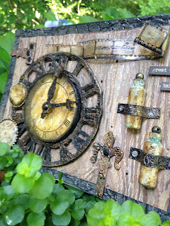
My large clock is an acetate clock face from my stash.  This really is my favorite element, and I love how it appears to be illuminated from within. I gave the face some dimension by making a cardboard ring for it to sit up on.  This was given it's grungy look with texture paste, Wow! embossing powder, Black Glint, and Distress Paint, Black Soot.


The clock and hands are Tim's Weathered Clock die and 3 layers of chipboard.  I used texture paste, Tim Holtz Ranger Crackle paint, Black Soot, various Distress paints, and metallic wax rubs to get a different grungy look.


I used the technique on a glass watch crystal for the larger watch face.  The image is Tim Holtz--The Journey, inked in Archival on white paper, and distressed with Distress inks.  I edged it with an altered neck chain from my stash--alcohol ink and paint to age the chain.


 It was very difficult to capture the cracks on this; better seen in this shot although blurry; I only have my Iphone.

The small watch also got the  treatment, and I added some Ranger Stream alcohol ink to the reverse side.  This is a plastic watch crystal, and I found it did not take the technique as well.  But I still love the time worn result.  The clock image was given to me by a friend, and inked with Archival and stamped on white paper distressed with Distress inks. I used yet another smaller bead chain from my stash, also altered as before.


I used Tim's Faux Cracked Glass technique on two vaccination bottles from my stash.  These don't come with corks, so I topped them off with a metal bead from yet another ball and chain from my stash after filling the altered bottles with clear seed beads. To get the bluish cast, I put a drop of Stream alcohol ink and a squirt of Ranger Blending Solution in the bottle and swirled it around 'til it finally dried or evaporated 2 days later!  Yet another look from the technique!  Clue: I tried a different base ingredient, and it gives a wonderful chunky and bubbly glass effect like really old glass!


Lastly I tried the Faux Cracked Glass on Tim's filmstrip ribbon.  Again, plastic, and it doesn't take as well.  But I still love the old grungy look.  Afterward, I used my heat gun to give the filmstrip a little flair, and then decided to stamp a Cloud 9 sentiment on it.  Note to self--it is easier to stamp on a flat surface than a curled one!


I used "Great Things Take Time" from Idea-ology Small Talk, because as a father of two 16 year-olds who are a work in progress, I wanted to remind my husband they are not "finished" yet. As any parent of teenagers knows, it is very frustrating at times when you think they should "get it" by now.  So not a traditional Father's Day sentiment, but he will understand the underlying meaning.


I was inspired by Deb Riddell of Paxton Valley Folk Art with her stunning Flower Garden Thank You card, and her use of Tim's Crocodile Layering stencil, in making my black background paper. I broke mine out and used it with texture paste, Stampin' Up embossing powder, Midnight Black and Distress paints to get my faux leather look. Thank you, Deb!


My wood textured background was made using the wax paper resist technique and a Tim Holtz Woodgrain Texture Fade, and Distress inks and paints. Then I used a TCW Woodgrain stencil, texture paste, and Distress paints, stains and inks.  I gave it a splatter of water down Black Soot Distress paint.

The Hardware Findings and faux iron bars holding the bottles are made from card stock (3 layers for the hinge), texture paste, Distress paints, and metallic wax.  I used a tiny bit of Meadow alcohol ink and Cloisonne granules on the hinge.  The "galvanized screws" are hole punches and Brushed Pewter Distress paint, and the indention is made with my nail.  The "iron nails" are card stock, texture paste and Tim's crackle paint in Black Soot.


I would like to enter my card into the following inspiring challenges:

Mixed Media World MMW#4 "Masculine/Father's Day"

Try It On Tuesday "Watches and Clocks"

Studio L3 Compendium of Curiosities 3 Challenge #30

A Vintage Journey "Celebrations"

SanDee and amelie's Steampunk Challenges "The Ravages of Time" June Challenge  I hope my metal clocks will be considered Steampunky enough!

Craft Stamper Take It Make It June Challenge 'Take a Technique' Texture

Mixed Media Card Challenge #12 "Collage"


Thank you for visiting today and leaving one of your awesome comments!  I read each one, and they really make my day! Hugs and Blessings!

Sara Emily

Tuesday, June 9, 2015

Shabby Monochromatic

Hello Friends!

Today I am sharing a card  I made to celebrate my Mom's birthday.  The super-talented Cec is hosting a monochromatic challenge at Frilly and Funkie, and as soon as I saw her marvelous monochromatic purple card, I knew just what I wanted to make for my Mom. You see, my Mom lives her life in purple, and has for years!  I'm sure if she knew how, she would dye her hair purple! So here is my card I made to honor her and her special day.


To say that I was inspired by the Frilly side of the Frilly and Funkie Design Team in my make is an understatement. Obviously, Cec inspired me with her color palette,   Pamellia inspired me with her homemade papers, Georgie inspired me with her textured background, and Linda's swirls and doilies inspired my use of those on my monochromatic Shabby (!!!) card.  I emphasized shabby, because that's just not something I do every day!

I was just so inspired, too, by  one of my favorite Tim Holtz' Distress colors: Shaded Lilac. Oh, how I just love that name!  My favorite place to be as a child was at the base of a lilac tree that grew just outside our living room window. And I love how this color can look so entirely different on a variety of surfaces and in the various mediums, from a soft lilac to almost a periwinkle blue. Here is my card in a different light, taken on a piece of statuary and with my hydrangeas in my yard (sorry for the messy nose--bird poop!). Can you spot what's missing? Yes, the hat pins!  It seems like I'm always forgetting something!


Another Tim inspiration comes from his love of all things vintage, and I feel I've given my card a little vintage vibe with my "vintage wallpaper" tag here.

The bottom layer started as a cereal box, which I covered with coffee filters and cheese cloth using gel medium to adhere. I added some purple micro beads at this point.  I gave the entire thing a coat of gesso and threw on some clear  micro beads.  When dry, I swiped some crackle texture paste through Tim Holtz' Flourish Layering stencil and allowed to dry.  I wiped on some Distress paints in Shaded Lilac, Chipped Sapphire and Seedless Preserves and spritzed with water to blend.  Next up, Dylusions Concord Grape spray ink, followed by a little Bell Bottom Jeans Glimmer Mist. I'm not a purple kind of girl, but I just love how pretty this turned out!  It's almost a shame to cover it up!


 I added the home made paper clay rose from my bits box, painted it, and adhered it with some more clear micro beads and added a few more beads here and there.  The Glue and Seal brought the pink out of the Seedless Preserves from the background.  I hope that doesn't take off points! I distressed the edges which left a little brown from the cereal box, so I swiped on some texture paste just on the edges to cover the forbidden brown.


The lavender tiny floral layer is just DP from my stash, and I added some paints and inks to the reverse side. 


The debossed layer is purple card on which I laid down a leaf mask (Crafter's Workshop) and spritzed with Plain Jane Baseboard Matte Mist in Ivory.  Then I debossed with an inked (Distress Shaded Lilac) Darice embossing folder. Afterward, I painted the petals with a mix of Shaded Lilac Distress paint and Dylusions Concord Grape and highlighted them with Picket Fence DP. I distressed the edges and dabbed them with Violet Dauber Duo.


The tag is cut from the same purple card, which I heat embossed using a Tim Holtz stencil, embossing dabber, and clear embossing powder, then swiped with Shaded Lilac Distress paint.  I gave it a quick wipe with a damp baby wipe, making it appear to be vintage wallpaper. I distressed the edges and left them bare. I splattered both the purple card and tag with Picket Fence DP.


I used Tim's Tattered Florals die and white card  to make my flowers.  I used Shaded Lilac Distress Ink to color them. The fibers were dyed using Seedless Preserves ink. The foliage is a Tattered Lace die. Bow and ribbon are died with Shaded Lilac Distress ink. 


 The butterfly is a Martha Stuart punch. I made my purple paper using Concord Grape and Bell Bottom Jeans and a spritz of alcohol for a very cool blend.  My sentiment is on a hand cut banner using Royal Purple Staz-On ink and a Stampin' Up image.  I used my Distress spritzer with Dusty Concord Distress marker and edged with Shaded Lilac ink.


The heart doily was fussy cut from a much larger doily, and stamped with a Stampington and Company image and Shaded Lilac ink.  My stick pins were pearl, so I dipped them in Picket Fence DP for a white accent, and the cheesecloth was also painted so it would be cohesive (it looked a little off white).  I used a Sizzix curly Gate die to cut my swirls from white card.


I know my Mom is going to love her birthday card,and I'm so grateful to Cec and the Frilly side of the Frilly and Funkie Design team and Tim Holtz for their inspiration.  Monochromatic is not the easiest, but it sure was fun!


I would like to enter this into the following inspiring challenges:

 I used 2 stamped images on my project.  Butterflies and flowers and a June birthday all remind me of summer!
 To be honest, I had to look the word up to be sure I was within guidelines.  Collage " an artistic composition made of various materials glued on a surface" I think this fits the bill!


Well, you're going to think I never frown!  Celebrating special birthdays makes me smile.  Knowing my Mom will love my card makes me smile. Flowers and butterflies make me smile. "Shaded Lilac" makes me smile!
 Perhaps more of a vintage shabby; I thought my tag layer looked like vintage wallpaper.

Thank you so much for stopping in today, and as always, I love reading your inspiring and encouraging comments! Hugs and Blessings!

Sara Emily


Friday, June 5, 2015

Anything But Cute Mixed Media Challenge-#2-Make It Masculine

Hello everyone!

 Today marks the beginning of our second challenge over at  Anything But Cute. Thank you to all those who entered our last challenge, and for those who visited and left lovely comments!  I would call our first challenge a huge success, thanks to all of you! The wonderfully talented Cec is our hostess for this month's challenge, and she has chosen the theme "Make It Masculine".

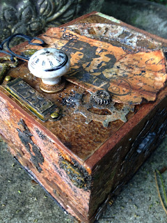
For my project, I went with a steam-punk-ish/John Wayne-ish cigar box tranformation. I made this as a Father's Day gift for my husband, so he can store all those little notes the kids wrote him when they were little.


For this challenge, Cec would like you to make a mixed media card or other project for a fellow in your life. It could be for Father's Day, a birthday, an anniversary or just because you want him to know how special he is.


 I actually started this a couple of years ago.  I was trying out a wax paper resist technique on another project, and I loved the "waste" wax paper so much, I just had to use it! A friend of mine gave me a huge tub full of cigar boxes, and so I got right to work using the wax paper on one of the boxes.  But after doing two sides, I got bored and up on the shelf it went, until I heard about Cec's "Make It Masculine" challenge.

I love leather and rust, and both of these just smack of "masculine" to me. So you will see that I used a lot of both of these elements in my altered cigar box. More is MORE, I say!

My cigar box started out like this.

To get a tooled leather look, I papered four sides of the cigar box with wax paper, which was embossed using Tim Holtz'  Regal Texture Fade.   After using the embossed wax paper for a resist on another project, and therefore, rendered basically wax-less wax paper, I colored the "waste" wax paper with alcohol inks to get this tooled leather look.  After I glued it on, I added some grunge to it, using stencils, texture paste, crackle texture paste, micro beads, Cloisonne High Gloss Granules, embossing powders, Distress embossing powders, stains, inks and paints. Note to self: Open the Closet door before going at all these chemicals!

For the lid of the box, I decided to go with a different leather look.  This time I used a simple brown paper shopping bag as my substrate. I've used variations of this technique several times before; I've used Kraft Core HERE and  a water spritzed lunch bag HERE to make backgrounds similar to this.


I used Distress inks, a Tim Holtz Pocket Watch Texture Fade, a Darice Crackle embossing folder, Glossy Perfect Paper Adhesive,  Rock Candy Distress Crackle Paint and a touch of  metallic wax medium to make this leathery-looking lid. Fortunately, I took a photo in progress; otherwise, you would never get to see how textured it is! Ha! Ha!  A little bit of a wasted effort, but at least I know it's under there!

 I used a piece of a  Tim Holtz Weathered Clock die cut from my leftovers pile and added texture paste, distress paints, embossing powders and Cloisonne Granules. I found the metal hinge on  my work table, and I have no idea how it got there. But it was a perfect addition, so I painted it and grunged it up from it's original shiny brass finish.


The tag is  stamped with a  Paperbag Studio image inked in Archival. I added a watch button from my stash--aged with Crackle Accents and black texture paste-- and a Tim Holtz Remnant Rub. I aged the Spare Parts knob with alcohol inks and Distress embossing powder. The number plate is made from a Tim Holtz  Ticket Texture Fade and a pink metal label frame. The brads were given a coat of Tarnished Brass Distress paint.  Here's the "before" when I was working on my arrangement.  The hinge had only been painted with Black Soot at that point.
.


Here's  how I made my rusty cogs: I used Tim Holtz'  Gadget Gear die to cut the cogs from Grunge paper and blotted them randomly with silver alcohol ink Mixative and a drop or two of Blending solution on a felt blending tool, leaving some areas unpainted.  After this was completely dry, I wiped on watered down Black Soot Distress paint with my finger and wiped it off with a paper towel.  The Mixative acts as a resist of sorts, and most of the black paint wiped off. Caution: you're going to think you need new glasses when you look at these blurry shots.  There's only so much I can do with an  iphone camera!


Next I splattered on Distress paints, drying with a heat gun between each to build up the color.  I used Black Soot, Spiced Marmalade, Vintage Photo, Fired Brick and Antiqued Bronze. Before drying the last color, I sprinkled on a little Tea Dye Distress embossing powder and then heated to emboss. I then added a few more paint splatters, drying between colors. You can see the cog is really starting to curl up!


I dabbed on some Vintage Photo Distress stain, and sprinkled this with more Tea Dye Distress embossing powder, then heated.  A few more splatters of Distress paints, heated between layers to finish off the color.  To give it just a little more texture and to flatten the cogs out, I dry embossed them with a Sizzix embossing folder 2 times.  Here is what the folder looks like. I don't know the name;  I purchased it used at a yard sale. It's hard to see the texture in the second photo, but it really adds a lot in real life


I followed a similar routine for the rest of the cogs, but used other products, and different sequence of paint application, and omitting the alcohol ink on some. I used clay embossing powder, Tea Dye Distress embossing powder, and Cloisonne High Gloss Granules on some of the cogs and some were cut using Tim's Steampunk On the Edge die.  I had so much fun trying different combinations, and enjoy seeing the results. (Each one made me smile, Jan!) That is what I love so much about mixed media--there are no mistakes!


The smaller cogs are made with paper clay and a Mod Podge mold. I painted and heat embossed them added micro beads to some and high lighted some of them with metallic wax medium.

The corners on the front of the box and key  are also made with paper clay and a Mod Podge mold and painted and heat embossed in the same manner as the smaller cogs.


I used Tim's Hardware Findings die for the keyhole and hinges using waste packaging for the keyhole and Kraft Core for the hinges. I used black texture paste, distress paint and embossing powder to make the keyhole look like old iron, and 2 brads were rusted for the nails.  The phillips head screws securing the hinges are made from grunge paper-- an idea I got from our super talented and lovely Pamellia at My Little Craft Things.  I changed her technique up a bit by folding the die cuts in half, sanding and painting the ridge with Black Soot.  Then I painted and embossed with Tea Dye Distress embossing powder.


In each of the four corners, I added paper clay medallions, crackle texture paste, micro beads, embossing powder and Cloisonne Granules, to give it an old mildewed look. If you've ever spent time in a barn you know that even the nicest leather ends up looking like this.


Here's a view of one of the sides.  You might have noticed there's a black cord at the bottom.  It's just simple black cord that I dipped in Mod Podge and left to stiffen over night.  It's got a great leathery hand to it and attached around the bottom of my box like a dream.  I used Tim's Measured Layering stencil, texture paste and Peeled Paint and Tea Dye Distress embossing powders and clay embossing powder to make the design.  I wiped on some metallic wax medium to high light.


The opposite side; more of the same. The clock hands were done the same way the key hole was, and fastened with an altered brad. A couple more paper clay gears and cogs.


And finally, the back of the cigar box.  I had removed the label before adding my wax-less wax paper, and so I added it back and distressed it in keeping with the vintage look.  More cogs and gears and a steampunk clock made with the same mold but this time with Sculpy, because paper clay just wouldn't cut it for this shallow mold. I cut my "leather" (Kraft Core) using Tim's Ticket Movers and Shapers die and added some "nails" made out of grunge paper.


Here's another look at my steamy-leathery box.


That's it for today! Please let me know if you have any questions.Thank you so much for stopping by and leaving your lovely and encouraging comments!  I hope you will be inspired to join in with our "Make It Masculine" challenge at Anything But Cute. I can't wait to see what you make for the man in your life! Hugs and Blessings!

Sara Emily

I would like to enter this into the following inspiring challenges:


Mixed Media Monthly Challenge #13 "A Year of Choices" I chose MMMC #2 Around the House.  I used wax paper as "tooled leather" and a paper shopping bag for "leather" in another background. If a cigar box counts, well, I used that, too!  It's just not commonly found around our house!


Our Creative Corner "What Makes You Smile?" Knowing I was making a special gift for my husband had me smiling the entire time I was creating this. Rust and grunge always make me smile.  Altering things and making something from junk makes me smile.  

A Sprinkle of Imagination "Anything Goes" I used lots of Distress products, which A Sprinkle of Imagination sells in their shop.

Sandee and amelie's Steampunk Challenges "The Ravages of Time" This is my first time entering this challenge, and so excited to find it. I may just have to enter more often, now that I've given steampunk a try!