Hello and welcome! Today starts a new challenge at The Funkie Junkie Boutique blog. The incredibly talented and creative Suzz is our hostess, and she chose the theme, Leap into The Odd. Here's her description of the challenge:
"2020 is a leap year which means we will have an additional day in February ending on an odd number of days. The definition of odd is "different from what is usual or expected; strange." My challenge to you is to create something odd or unusual. Also you must tell us what is odd or unusual in your project when you share it with us!"
As always, the winner will earn a chance to be a Guest Designer at a future date at The Funkie Junkie Boutique blog, and everyone who enters and follows the rules will go into the draw for the chance to win a $25 spending spree at The Funkie Junkie Boutique. There are also Top 3 Badges for three additional outstanding entries, chosen by the Design Team. Please see the blog for details.
I'm going to share some closeup photos, and then a few process photos that might help you see what is odd about my spring card beside the fact I used a Tim Holtz Halloween Creepy eye and some feathers from a Halloween boa to embellish the bird from Tim's Modern Christmas stamp set. The plumage on his head is pretty obvious, but did you spot his tail feathers?

I popped the iris from the Creepy Eye and patted it with Picket Fence paint to take the shine down. It's a little large, but that makes it that much more odd.
I had a portion of a Destinations Thinlits die cut on my worktop, and left it in it's original white card state; perhaps a little odd to have pure white on a vintage card, when everything else is tinted with Antique Linen or another darker color. Even though a globe is in no way related to the overall theme of the card, I think it works like a doily for a place for your eye to rest on this busy card.

I was excited to get my hands on the Modern Christmas stamp set, but sadly, it was after Christmas. I think the bird works quite nicely on a spring card, don't you? He's inked in Vintage Photo and Spiced Marmalade Distress Archival ink and blended with Mermaid Lagoon and Black Soot ink. Large Funky Floral and Garden Greens Thinlits flowers and foliage make a nice contrast to all the dark and vivid colors. (Perhaps the dark/vivid color scheme could be considered another oddity?)
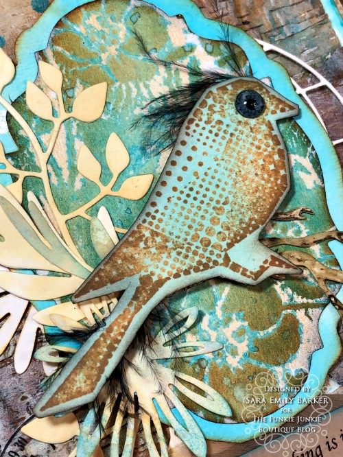

The branch from Large Funky Floral set may seem a bit odd; typically it points in the opposite direction. After cutting it, I flipped it over and dipped it into Antique Linen Oxide and heat embossed with Eileen Hull Molten Dimension Glistening Glass Embossing Powder. I don't like shiny, but I do love the texture the powder creates, so I scribbled it with Walnut Stain Distress crayon to bring out the bumps and to hide the glare.

I gave it another coat of collage medium over top and after it was dry just to touch, I sprayed with Mermaid Lagoon Distress Oxide spray and wiped with a paper towel to leave it to just lightly tint the bark. I blended Walnut Stain crayon around the edges and to highlight the texture of the bark layers.
Using a Shifter Mini Stencil (but not shifting) and Mermaid Lagoon Distress paint, I added the dots. Finally, I patted with entire panel with Picket Fence paint using my finger and used some old Remnant Rubs on the background. Nothing out of the ordinary there, just some good messy fun.

I was going to use this panel of Tim Holtz Christmas paper stash which I stenciled with Transparent Matte Texture paste and Tim's Floral stencil, but that turned out a disaster. I'll probably use that on a future project, if I can figure out how to salvage it. In the meantime, rather than waste all that great texture paste on the reverse side of the stencil, I turned it over onto a scrap to make a monoprint, which didn't turn out much better.

Once the monoprint scrap dried, I sprayed it with Oxide spray and water and moved the color around, blotting with a paper towel as I dried it. Yay! Salvaged! I love how the color settles in around the dried paste design. I blended with Antique Linen Oxide ink and Rusty Hinge ink when it was completely dry and die cut with Stacked Baroque Thinlits. I think this is a bit of an odd way to make a background, and I love the effect. I'm pretty sure I couldn't make another one if I tried. I only took the photo to remind me of what colors I used; I'm not exactly sure of the exact process.

My sentiment is cut from this clothing tag I had in my stash. What's so odd about it, there's no one that's a size 7 in our family! My guess it's been stashed for a very long time.

So that's it for my odd spring card! Here's one more look at the completed project. There's a whole bunch more odd inspiration at The Funkie Junkie Boutique blog, created by my talented teammates, so I hope you'll pop over to check them out!

I hope you've picked up some odd ideas to use and that you'll link up your own vintage or shabby chic project to be in for a chance to win one of the awesome prizes! Don't forget to tell us what's odd, because we likely won't be able to pick it out on our own! One man's 'odd' is another man's 'normal'. I can't wait to see what you will create!
Hugs and happy crafting!
Sara Emily
Challenges I would like to share with:
These products were used on my project and can be purchased at The Funkie Junkie Boutique:
Ranger Tim Holtz Distress Ink -- Black Soot, Rusty Hinge
Ranger Tim Holtz Distress Oxide Pads -- Antique Linen, Mermaid Lagoon
Tim Holtz Ranger Distress Paint -- Mermaid Lagoon, Picket Fence
Ranger Tim Holtz Distress Oxide Spray -- Mermaid Lagoon