Tuesday, June 28, 2016

Pastel Baby Shoe

Hello again! I'm back with my second post today and only have minutes before the Pastels and Pearls challenge at Frilly and Funkie closes. I've had a vision of a baby shoe made into home decor in my head for awhile and really wanted to get 'er done for this challenge.


My nephew and his sweet wife are expecting their second baby next month, so I wanted to make them a little pin cushion for the new baby's room. They chose to be surprised and do not know if they will have a boy or girl, so I made a pastel yellow shoe with hints of pink and blue. I tried to be non-partisan and gave equal time to the pink and the blue, but I'd really like them to be blessed with a baby girl! They already have a sweet little boy.

I picked up the shoe at an estate sale last week--the lady must have thought I was crazy for purchasing just the one shoe! If it had a match I would have bought that, too! 

I stenciled the white cotton fabric with a TCW stencil and Distress paint, Spun Sugar, baby blue and buttercup acrylic paints. I quite like how it turned out! 


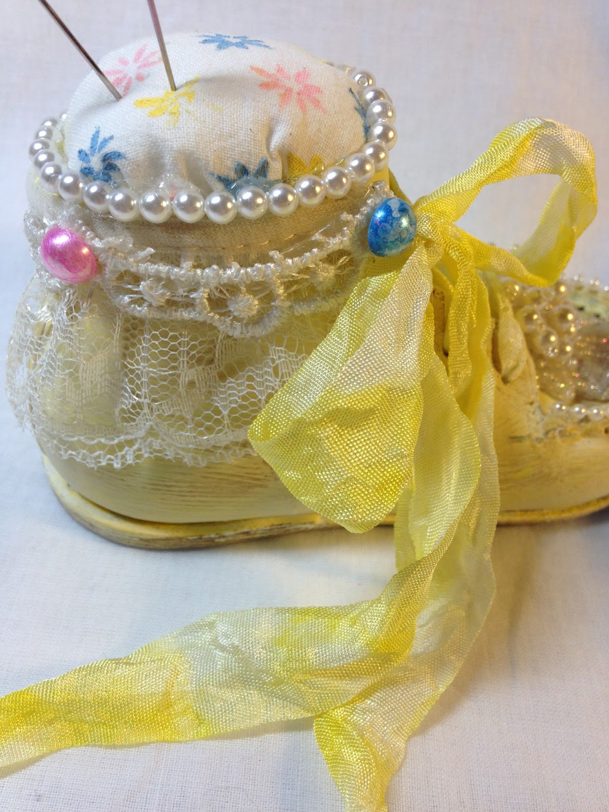
I gave the shoe a coat of gesso and painted with buttercup yellow acrylic paint. I gave it a wash of Picket Fence Distress paint and wiped it back to make it even more pastel. Lastly, I wanted a vintage look, so I scuffed it using DecoArt Antiquing cream. I added layers of lace and pearls from my stash.  The pink half pearls were colored with Liquid Pearls and the blue with Sailboat Blue and the white mixative alcohol inks. The pins are from my stash--the pink was already--well-- pink, and the blue was painted like the half pearls.


Crinkle ribbon was colored with Distress ink in Squeezed Lemonade, and the lovely blingy and pearly piece is from my stash.  I believe it started life as an earring.

I hope you like my little altered baby shoe! It was so much fun to make and only took a few hours start to finish.  Most of that time was spent looking for just the right embellishments.  The photo below is not the most flattering of shots, but I am squeezed for time and wanted to include a face on shot. It does look like a face, doesn't it?! Oh, my! I think I need some sleep!

Thank you to Nancy at Frilly and Funkie for the inspiring challenge! I wouldn't have thought to make this cute little piece of home decor without her challenge and the wonderful inspiration from all the talented Frilly and Funkie girls on the Design Team.


I'm sharing this with...

Thank you for stopping back in and for all your lovely comments. I read and appreciate each and every one of them!
Hugs and Blessings!
Sara Emily

UPDATE: Yippee!
   

Monday, June 27, 2016

Keys to My Heart

Hello friends and visitors! I hope you've been finding time to be creative!  I've turned my back on my paper and card stock and made my project mainly out of metal. Here are the keys to my heart (rust, metal, grunge).


It's hard to tell which is the front and which is the back, so I'll show both and let you decide. I really should stop making 3D projects, because they are so hard to photograph, and I must bore you with so many photos. As you might be able to tell, it was raining (finally) when I took these. I had to take the shots outside, because the light in my studio reflects off all the metal.


I'm sorry I've got no process shots, but I'll make up for it in close ups. I started with aluminum foil and masking tape to form my heart. I cut up pieces of  air conditioner's/plumber's tape and embossed them with a Lifestyle Crafts embossing folder. I used these pieces to cover the heart and colored the heart with a variety of alcohol inks. I gave it a coat of Black Soot Distress paint and before it was fully dried, I wiped most off to leave it in the recesses. I heat embossed with my beloved Burnt Copper Leaves embossing powder randomly (sold at Emerald Creek Craft Supplies--I can't locate a link). See all those nice metallic bubbles? That's the powder heated slightly; when you heat it longer it forms a nice smooth enamel--not the look I was going for on this project.


This entire project was inspired by a box of keys I picked up at my neighbor Hilda's house when it was being cleaned out following her unfortunate passing earlier this year. Many of the keys have unique shapes, but  are not especially old, so I aged them and a metal keyhole embellishment from my stash with black gesso, DecoArt Sand Texture paste and media paints in Raw Umber, Quinacridone Gold and Cobalt Teal.  I embossed with just a touch of Distress Tea Dye Embossing Powder. I also made a few keys and another  keyhole using air dry clay and a Mod Podge mold. I colored them with Prima Alchemy paint in  Steampunk Copper, Deco Art Raw Umber, Quinacridone Gold, and  just a touch of Cobalt Teal. I was able to bend the metal keyhole and mold the still pliable keys and hole to the heart, but there was no budging those real keys!


See the "nails" on the keyhole and periodically on the upholstery tacks? Those are black half pearls colored with black gesso and watered down Steampunk Copper. I think this just might be my favorite detail.


I bet you wish these close ups weren't so blurry; I know I do! Mr. I wanted to focus on all that foil!


I'm very fortunate to have purchased a very large roll of brass upholstery tacks (well that's what they look like to me) from Hilda's estate sale last year, and these work as a perfect embellishment. I aged them in a similar manner as the keys and adhered them to the heart's edges which was tricky to say the least. Golden glass bead gel adds some rusty grunge to my heart.


And a few more random shots. I assure you, no paper was harmed in the making of my heart!


I am sharing my heart with the following challenges:
Mixed Media World MMW #15 From Scrap to Masterpiece My scraps are keys getting ready to be thrown in the dumpster.
Mixed Media Monthly Challenge #25 2nd Anniversary I chose Texture - November 2015
  

Thank you for stopping by today, hanging in there with me,  and for all your wonderful comments. I read and appreciate each and every one of them! 
Hugs and Blessings!
Sara Emily

Sunday, June 26, 2016

Listen to Your Art

Hello crafty friends and visitors! I had a little mixed media fun in my closet today with a couple of special challenges in mind. Here is my over sized tag using a "practice" journal page torn from my art journal. I ended up not using it for the intended purpose, but thought it was a great start for this tag. Rule #1-NEVER throw anything out! It may just be your next "masterpiece"!


My original project was going to have a sun on it, but I changed my mind and tore out the journal page. Here's how it started as a different project: For the background I gave my card a coat of gesso then spritzed with Dylusions blue sprays while still damp. I immediately spritzed with alcohol and splashed with some water droplets. I let this dry. Next I laid down some texture paste through a Tim Holtz Speckles stencil laid over his Rays stencil. Not at all part of my design plan for this tag, but it gave lots of texture and most would be covered anyway.

This is where I start with the plan for this tag: I chose a few blue guache colors and watered them down. I applied them to the dried tag and spritzed with water to move the color around. I flicked more alcohol and water at it for visual texture and allowed it to all dry.  Watercolor used to be my favorite art medium, but I'm quickly becoming a guache convert.

I added more stenciling using a home made bricks stencil and Distress Picket Fence Crackle Paint.


I splattered with watered down white acrylic paint and added random stamping using a Heidi Swapp musical image. The quote is actually from two separate older Tim Holtz sets--both had the word "heart" in them. The "Listen to your heart" image did not clearly imprint the word "heart", so I borrowed "art" from another "heart" quote.  These were stamped in Archival ink on Tim Holtz plain Tissue Wrap and adhered with Multi Matte Medium. Nearly seamless collaging with that Tissue Wrap! I edged the tag with Frayed Burlap Distress ink and distressed and layered with more card.

The frame is Tim Holtz Ornate Frame covered with Golden Crackle paste, and sprinkled with Holographic and Frantage (sparingly) embossing powders. When the paste was dry, I hit it with my heat tool to melt the powders. The camera barely picked up the sparkle. It's amazingly shimmery in real life! Half pearls in a gold color from my stash. Usually Golden gives the best crackle, but this jar seems to have left out it's crackle--I have yet to see good cracks come from this jar.

I hand cut the tag from heavy watercolor paper and stamped another old Tim Holtz bird image. I used Distress Markers directly on the stamp, spritzed lightly with water and stamped the image for a watercolor look. The musical notes (I hope they look like musical notes) are hand drawn and pearls added. More Frayed Burlap and distressing for the edges.


The two blue flowers are handmade using Tim's Tattered Florals and a lighter weight water color paper I used to mop up the guache paints on my craft mat. I flicked some of the papers with watered down black guache. I'm afraid I've lost some of the variegation of the flower's colors in my lack of photography skills and having to shoot this at night. I gave the white rose and the pebbly stamens a dusting of whatever was on my blending tool--I think Rusty Hinge. All the pearls and other stamens were colored with Butterscotch Alcohol ink to somewhat match the half pearls from my stash. Gold microbeads finish the flowers off. Various die cut foliage added from my scrap pile.


I hope you like my tag! I'm going to share it with the following challenges:
A Vintage Journey Texture or Embossing Paste I used texture paste on the background (not the bricks) and Crackle embossing paste on the frame.
Mixed Media World MMW #15- From Scrap to Masterpiece My tag was created from a torn out journal page that didn't go right the first time around.
Mod Squad Challenge All That Glitters I used glittery embossing powders on my frame.


Thank you for your visit today and for all your lovely comments! I read and appreciate each one of them!
Hugs and Blessings!
Sara Emily

UPDATE: Yippee! I was a Top Pick at Country View!
   

Thursday, June 16, 2016

12 Tags of 2016-Technique Remix June-Tissue Wrap Collage-Stencil Plaid

Hello friends and visitors! I'm excited today, because I've finished my tag for June, and it's early! I sure was befuddled by this one; nothing I had in my pretty large collection of Tim Holtz dies and stamps seemed to fit the bill. And there sat my inspiration right at my feet-Biskit-my curious, playful, painfully fun-sized kitty whose main purpose in life is to seek out tidbits from my Closet and hoard them God knows where. Oh... and sleep. So here's what I came up with; a fun tag filled with silliness using Tim's June awesome twosome-Tissue Wrap Collage and Stencil Plaid Techniques.


Check out Tim's June tag on his blog--these techniques were made for that Dapper die and Tailor and Houndstooth stamp image! Love the simplicity of his tag this month, and even more in love with the plaid. (I usually include his photo here, but I was getting a security warning when I copied and pasted.)

I've had the Crazy cats stamps and dies for quite some time now; they were a gift from my lovely daughter for my birthday, but this is the first time I've used them. I don't have the Substrate Tim used, but I did use the waste packaging from the  Textile Surfaces as my substrate for the Tissue Wrap. I followed Tim's instructions but used stamps from two older releases: Boundless Flight (Harlequin) and Curious Possibility (definition). I hope you get the significance of the Curiosity stamp and can read the fine print. "curious as a cat", "prick up the ears", "stare", gape" and "snoop" all seemed fitting for my little feline.


I love the new plain Tissue Wrap--it is lovely to handle and smooths down so easily. Stamped images come out crisp on this surface. I often  add images on tissue to my work, and it has a tendency to tear. So I will be getting lots of use out of this perfectly sturdy Tissue Wrap.

My sewing machine is worthless, so I tried my hand at some hand stitching at the top, but I soon got tired of that. I hope adding the vintage dyed lace along the bottom serves as a substitute. I dyed the lace and crinkle ribbon with Abandoned Coral spray stain. I also used Abandoned Coral in ink form on the ball of yarn and heat embossed in clear.

I love how expressive the Crazy Cat's eyes are.  It you turn them one way you get a whole different expression that if they were another.  I turned mine upside down to get that deer in the headlights look Biskit always has (when she's awake).

I added the birds on a wire Remnant Rub at the top, since Biskit spends her free time (after raiding my Closet and sleeping) watching the birds in the backyard from the french doors. The Remnant Rubs stick seamlessly to whatever you want to stick them to--here the textile surface and the stamped and Vintage medium'd Tissue Wrap.


I added some shading around the kitty with Walnut Distress crayon, and used it to color the die cut tail and inner parts of the kitties arms while I had it out. I wanted to bring extra attention to the tail, as Biskit's tail is always twitching, as if she is annoyed with your very presence. I clear embossed a trio of fish bones, too, and added Glossy Accents to the eyes. I cut a few more of the kitties and adhered their negatives to the back of  the collaged surface. This provides some separation of the layers, since my chosen plaid colors are close in color to the Vintage collage medium.  I used inks in Ground Expresso, Vintage Photo and Fossilized Amber for my plaid, since Biskit is a brown tabby. I hand drew her little nose and mouth and gave her a sweet little bow around her neck.


"Remember to Play" Chit Chat seemed to be the perfect words to add.


I hope you like my playful tag! I sure had fun making it, and can't wait to see what Tim has to inspire us next month! I'm looking forward to seeing all the entries this month, too!


I am entering my tag in the following inspiring challenges:
Die cut Divas June Anything Goes With Kaisercraft Tim Holtz Crazy Cats Thinlits die and Tim Holtz Bigz Tag and Bookplates die.
Southern Ridge Trading Company Anything Masculine  Well, sort of masculine in the colors and stamping. Feel free to delete my entry if you do not think it masculine enough.
Simon Says Stamp Wednesday Challenge Animal Magic In honor of  and inspired by my kitty.
Creative Artiste Challenge #15-Anything Goes I used Distress Vintage Collage Medium, Distress Crayons, sprays, and ink.


Thank you for stopping by today and for all your wonderful comments! I read and appreciate each and every one of them! 

Hugs and Blessings!
Sara Emily


UPDATE: Yippee!

Wednesday, June 15, 2016

Grungy Gift Box for Scrapy Land Guest Designer- Masculine

Hello friends and visitors! Today is my final Guest Designer post for Scrapy Land--a sad day for me! So, I wanted to make something special for their Masculine PLUS use any brand die that Scrapy Land sells challenge. Here is a gift card box I made for my husband for Father's Day. I think I went all out grungy for this one!


This tiny box (measuring approximately 3 x 4 inches) started out as a bookplate box with a gold foil cover. I removed the bookplates and the one on the top and got to work with white gesso on the top and black on the bottom.


A vintage book page, some Distress Vintage and Crazing Mediums and Distress crayons and DecoArt Quinacodrine gold paint and even a little stencil and texture paste later, this is what it looked like. This is my only process shot. The stencil is just an experiment; I knew it would be covered. I did use this DecoArt Short Circuit stencil with black texture paste on one of the sides, but didn't get a photo of it.


Here are the dies I  used--all of these are brands that Scrapy Land sells:
Sizzix Weathered Clock
Sizzix Hardware Findings
Sizzix Gadget Gears
Sizzix Movers and Shapers Keyholes

The large gears (Tim Holtz Gadget Gears) were cut from Grungeboard, and I used both the negative space and the gears themselves. I used DecoArt Texture Sand paste and Golden Bead Gel medium on the gears, and Golden Crackle paste on the negative to give them lots of texture. I also used a Tim Holtz Crackle stencil pressed into the crackle paste on the negative background piece--a trick my talented friend, Niki of Pawsitively Creative used on her awesome book here. I also added some random areas of  DecoArt Crackle Medium over my crackle texture once it was dry for even more crackle, just like Niki did. It's very hard to see in my photos, because most of it is covered up with the gears.

More Crackle paste on the clock hands (Tim Holtz Weathered Clock) and the nails.


The two smaller gears (Cheery Lynn) were a gift from Niki, too, and I grunged them up with DecoArt paints, Crackle Glaze, and antiquing creams and Bead gel medium.


The key (Tim Holtz Hardware Findings) is colored with Rusty Hinge Distress spray and Perfect Pearls powder and crackled subtly with Distress Crazing medium. I offset it just a tiny bit with a second black key to make it stand out, as well as added Burnt Copper Leaves embossing powder from my friend Kim's shop--Emerald Creek.  If you don't have this powder in your arsenal, I suggest you pick up some right away! I can think of a zillion uses for it, and it heats up beautifully either as a smooth finish or in the chunky bits like you see here. I added a Tim Holtz Remnant Rub in words that are very meaningful for me, but used here they are to remind my husband to look inside for his gift card!


I thought the finished lid looked a little harsh, so I added dyed cheese cloth and metallic threads in copper and bronze to soften the edges a bit.


This shot is blurry, but it really showed off the cracks from the Crackle stencil in the crackle paste, covered with Crackle Glaze. Now that's a lot of cracks!


The crackle glaze peeks out from under the key below, but is blurry.  Another bear of a project to photograph because of all the metallics and glazes competing for attention. I added texture to the sides of the lid with paste and Tim Holtz Speckles stencil on the sides and also added texture to one side  with Tile Backer tape. As I mentioned earlier, I stenciled pipes on one side of the lid with DecoArt's Short Circuit stencil, but failed to photograph it.


And of course, there's the bottom of the box to decorate! I used DecoArt paints, Crackle Glaze, antiquing creams, Perfect Pearls and Glimmer Mist sprays, more stenciling with Speckles, Alchemy paint, Burnt Copper Leaves, and more Tile Backer tape for the background. Two die cuts (Tim Holtz Keyhole and Cheery Lynn Gear) grunged up finish it off. Not pretty, but oh, so masculine!


One final look at the box top and bottom. I hope I've inspired you to get out those masculine or maybe not so masculine dies and join the Masculine challenge at Scrapy Land. After all, a generous gift certificate is up for grabs for one lucky winner!

Thank you to Anne and the entire Design Team at Scrapy Land for allowing me to be Guest Designer with them for these past few months--it has been a very positive experience, and all the girls are so warm and welcoming! Anne, a special thank you for all your help and patience!


I'm also joining these inspiring challenges:

Thank you for stopping by today, and for all your wonderful comments! I read and appreciate each and every one of them!
Hugs and Blessings!
Sara Emily