Tuesday, February 9, 2016

Purple Love

Hello again!  I guess you can tell I've been busy in the Closet.  This time I was experimenting with some new paints I picked up from an artsy friend who is going to focus all of her artistic talents into sewing! Lucky me, I was able to scoop up a bunch of her new, almost unused art supplies she no longer wanted cluttering up her space.


Have you heard about Creative Carte Blanche, the new challenge blog for crafters?  Their mission is to inspire us to approach our art with a sense of freedom and spirit of exploration. This blog was introduced by Linda Ledbetter, and the talented Design Team is made up of the girls from Compendium of Curiosities 3. I recommend popping by and seeing what all the hoopla is about; you won't be disappointed! So that being said, I HAD to try something NEW to me; well, a few things, actually.  There is nothing more inspiring than sitting down with something you never used before and just playing!


This card is actually a store bought invitation which I covered with distressed card stock on the back, and on the front--gesso, Distress paints in Shaded Lilac and Worn Lipstick, distressed papers and a pattern laid down with Hickory Smoke Distress ink and Tim's Dot Fade stencil.

Now here's the "Try Something New" part! Like I said, my friend Sharon was cleaning out, and one of the things I got from her was a brand new set of Reeves Gouache colors. I couldn't wait to use them! Gouache is an opaque watercolor paint--I learned that from my high school art classes, but somehow I had forgotten!  I expected the pigment to be thicker, like an acrylic or even as thick as oil. I was a little disappointed in it's thin consistency, so I added it to Golden gel medium before dragging it across my watercolor paper with a palette knife.  Here's why I wanted it to be thick...I was inspired by Autumn of Sew Paper Paint to scribe into my paint. Be sure to pop over for a visit; her blog is bursting with creativity!  Writing in paint is something I've never done before, and I happen to hate my handwriting. Here's a little secret....in penmanship class in grade school, I would let my sister do my homework for me, because she loved penmanship!  So no practice as a kid, and then years of writing in medical charts makes for poor handwriting. Hey, next to the Doc's, mine looked pretty good!

I digress...Since this is a card for my Mom, I thought she might like to see my handwriting on it. What a fun technique!  I just had to try it, but in my own Sara-style of trying something new.  Unfortunately, I didn't take process photos, because I was just too busy throwing this and that at this background.  But I did take notes.

After drying the gouache/gel medium layer, I used the negative space from Tim Holtz' Heartfelf die and outlined a few of the hearts with a reddish pink water color crayon and spritzed with water and dried with a heat gun. This didn't look so good, so I swiped on distress paints in Shaded Lilac and Worn Lipstick, blended with a spritz of water, placed a paper towel over the surface to absorb the extra water and quickly pulled it off to reveal a lovely subtle texture.  You can barely see a little of this at the top in this photo.

I added some stamping with a Stampin' Up script stamp and Watering Can Archival ink. Next up, I added some embossing using texture paste and Tim's Flourish stencil. Before it fully dried, I sprinkled lightly with Ranger Embossing Glitter Tinsel in Lavender and then thoroughly dried and embossed using a heat gun. Finally, I gave it a spritz of Tattered Angels Glimmer Mist in Viva Pink, then took the lid off and splattered some on with the hose end.


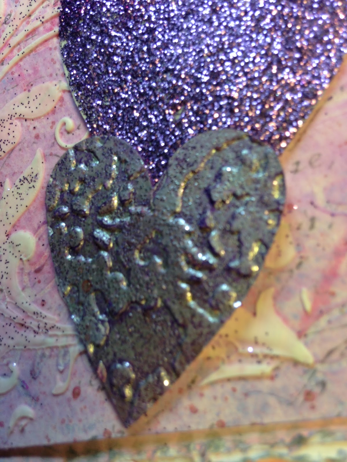
For the embellishments I used three of the Heartfelt die cuts.  I embossed the purple one in Ranger embossing Tinsel Glitter in Lavender (Some of it is chipped off, because Biskit is a thief!  My little kittie loves to prowl my desk and take shiny things.  It took me a 1/2 hour to find this after she took it off to her special hiding place! Needless to say there are teeth marks!) The two smaller hearts are heat embossed in Ranger Embossing Tinsel Glitter in silver, and each of them embossed with embossing folders: Cuttlebug Swiss Dots and Tim Holtz Damask. Lastly, I swiped on Wilted Violet Distress paint, dried somewhat and wiped back with a towel using Tim Holtz' Industrial technique.



The sentiment is Heartfelt Creations heat embossed with white powder on a scrap of vellum, which I cut into a banner.

 It was really fun to step out and try something new!  Thank you to the Design Team at Creative Carte Blanche and to Autumn for the little nudge.  I hope my Mom loves her purple card--her favorite color, of course!


I would like to enter my Valentine into the following inspiring challenges:
Frilly and Funkie Enjoy Your Embossing! I heat embossed, pressure embossed, embossed using stencil and paste, then heat embossed again, embossed my sentiment and you might even consider writing into thick medium a form of embossing!
Emerald Creek DaresValentine's Is NOT in the Air I'm going on the grey heart thing...my silver hearts look grey. :)
-A Vintage Journey Industrial Maybe I needed to go a little grungier?!
Scrapy Land Challenge # 35 Anything Goes I used a Sizzix die--just one of the 40 brands Scrapy Land sells!

Thank you for stopping by and for all your wonderful, encouraging comments!  I read and appreciate each one!
Hugs and Blessings!
Sara Emily
UPDATE: My card was a WINNER!
Mom loved it!

With Love Watercolor

Hello crafty people!  I decided to make a more traditional Valentine's Day card for my sister and brother in law.  There's nothing like a little clean out of your supplies to get the creative juices flowing!  


This smallish card started out as a store bought invitation, which I probably bought at a yardsale for the envelopes.  I figured I might as well use the actual card, too, so I started by cutting some card stock and papers to size, distressing them with my scissors and gluing them onto the existing invitation, which I gave a quick coat of gesso and Worn Lipstick Distress paint on the edges.

I splattered on some watered down watercolor crayon at this point and let it dry while I worked on my top layer.  Once dry, I swiped on some Ranger Multi Matte Medium and sprinkled with Martha Stewart Iridescent tinsel glitter (This was one source of inspiration I unearthered and had forgotten in my Closet stash. This will be my first time using this product.)


I was inspired by Suzz of Suzz's Stamping Spot with her watercolor hearts, so I went digging through my watercolor supplies and found these unused watercolor crayons. If you visit her blog to see her beautiful cards, you will see the inspiration is pretty clear. At first I tried watercolor pencils, but I didn't get the super watery look I was going for. I  cannot wait to get my hands on Tim's new Distress crayons, and have some on pre-order at The Funkie Junkie Boutique.

For the focal panel, I started with heavy weight watercolor paper, stamped a Stampin' Up Script image with Watering Can Archival ink, and edged the card with watercolor crayon. I spritzed with Pink Gumball Perfect Pearl Spray Mist and then water and swirled that around to get some drips and puddles of color.  Once dry, I placed the negative from Tim's Heartfelt Bigz die over and traced around the inside of three of the hearts, and again spritzed with water.  I dried this with a heat gun to push the color around a little and when fully dry, went back in with the stencil I had made and added more crayon, blending some with a water brush.

Next I did some embossing inspired by Nancy's (of My Tattered Treasures) method of embossing. Be sure to visit her blog, where no matter what the weather outside you will feel like it's a breezy sunny day!

 When the panel was completely dry, I used  Ranger Transparent Matte Texture Paste and several  different cheapo stencils to emboss some tiny hearts.  While the paste was wet, I sprinkled on micro beads and the tinsel glitter.  Once dry, I went around my embossed hearts with Festive Berries Distress marker and a water pen  to make the tiny hearts pop.


I finished this Valentine with a Tim Holtz Simple Sayings sentiment in Jet Black Archival and splattered on some coordinating watered down watercolor crayon. This is one of those cards that looks much better in real life due to the shimmer and sparkle that is so elusive on camera. I purposefully made my card flat, so I could post it from my home, and hopefully it will arrive in time.


I would like to enter my Valentine into the following inspiring challenges:
-Frilly and Funkie Enjoy Your Embossing My embossing comes in the form of hearts embossed with texture paste.
-Mixed Media Place-Creative Gym # 16-New Beginnings Trying something new with watercolors in the form of crayons, using a few new to me products.

Thank you for stopping by today and for your awesome comments!  I read and appreciate each and every one of them!
Hugs and Blessings!
Sara Emily

Friday, February 5, 2016

Leave a Little Sparkle

Hello everyone! I had a little fun in my Closet today, and made this snowy card for a blog friend.  She always brightens my day with her comments and I couldn't help but choose the Small Talk sticker for a sentiment on the front of this card. She always leaves a little sparkle for me!


 I photographed this outside in the sunshine and inside under my "studio" lighting.  Which do you like best?


I made the background by applying my beloved mechanical repair tape to card stock and embossing it with my Tim Holtz Snowflurries Texture Fade.  First I applied black gesso, heated it 'til almost dry (doesn't take much more than two seconds) and then wiped with a damp paper towel. I randomly swiped on Distress paints in Wilted Violet and Blueprint Sketch (great investment--I've used these a lot lately!) and followed with a bit of DecoArt Patina Antiquing Cream.  I wiped this back and gave it a spritz of DecoArt white Shimmer Mister.  I smooshed on some Picket Fence Distress paint with a makeup sponge to highlight the embossed snowflurries and heat embossed with Emerald Creek's Soft Fallen Snow powder. I  took the cap off  the Shimmer Mister and splattered some on with the hose end. I heat dried and added Stickles in Platinum to the largest snowflake center and wiped some on lightly here and there for a little extra sparkle.


The Small Talk sticker was colored with Brushed Pewter Distress paint mixed with Perfect Paper adhesive and more Stickles wiped on for extra sparkle, again in Platinum.


If you hold your mouth just right you can see the sparkle both on the background and in the center of the snowflake--it looks like a brilliant diamond.


I mounted the metallic panel on a panel which was stamped with... get this!!!...a Stampin' Round!!!! Wow!  I've had a drawer full these for decades and NEVER used them.  I was going to get rid of them the other day when I saw one with snowflakes! I inked in Watering Can Archival, dried and then went over the stamped card with a wash of DecoArt Titanium white and water.  I distressed the edges with scissors (wish I had one of those Distress it All's!), wiped with Versamark and embossed with Soft Fallen Snow.  This is very fluffy and shimmery in real life, just like fresh fallen snow!


That's it for today!  I hope you enjoyed my card and have a sparkly day!

I would like to enter my card into the following inspiring challenges:
Frilly and Funkie Enjoy Your Embossing Heat and pressure embossing used.
Mixed Media Place Creative Gym # 16 New Beginnings Fresh fallen snow always signifies new beginnings to me--a clean, fresh dusting ready for the first footprint to be made in it.  Following the theme, too, with achieving texture on a flat card--something new to me. New beginnings with my  newest paint colors.
Open Minded Challenge # 1 Something New New: Patina Antiquing Cream, use of old Stampin' Up Wheel--I've had for a long time, but never used. New techniques to me: using Stickles wiped on to create a glittery wash as opposed to applied thickly, white wash over stamped images, FLAT card! ( I usually make layered cards).
Stamps and Stencils Splatter, Spritz, and Smoosh! Now that's a lot of S's!  (I stamped with a Stampin' Round Wheel in snowflakes on my back card. My splatter, spritz and smoosh are in bold within the text of my post.)
A Vintage Journey-February Challenge-Industrial My Tim inspiration comes from his Painted Industrial technique.


Thank you for stopping by today and for all your wonderful comments!  I read and appreciate each and every one of them!
Hugs and Blessings!
Sara Emily

Anything But Cute-Mixed Media Challenge # 10-Grungy Love

Hello crafty friends!   It's time for our second challenge of the year at  Anything But Cute, and I'm your hostess this month.  I chose "Grungy Love" as our theme this time. I'll share the details of the challenge, but first here is my grungy Valentine gift box.


To celebrate St. Valentine's Day, we would like to see you make a Gungy Valentine's project for your sweetheart!  It can be a card, tag, or anything else you might give a loved one to show them how much you care.  Just be sure it's grungy!


Here is what my box looked like before I added black gesso, painted metallic paper, and handmade and altered embellishments.


To start, I gave the box a coat of black gesso, inside and out.  I traced around the lid onto card stock and cut out the heart, and measured and cut card to fit around the sides.Next  I did a little variation of a Tim Holtz technique from his Volume 3 Compendium of Curiosities. I added Distress paints in Wilted Violet, Chipped Sapphire, Shaded Lilac, Peeled Paint and Picket Fence randomly on the card, spritzed and blended some. I dried it completely.  It's not important what this looks like because next I covered it with Distress paint in Antiqued Bronze, spritz and flicked with water, and dried just until the paint that didn't have water on it was dry.  I quickly placed a paper towel over the surface, pressed it down to absorb the wet areas and quickly peeled it off to reveal the "chipped metal" surface.  I dried this well, and applied Black Soot Distress paint, and while wet flicked on some rubbing alcohol with my splatter brush.  I let this dry overnight, as it remains tacky for a while, but you could probably dry with a heat tool.  I know I could take this one step further, but I pretty much ran out of time at this point. Have fun with changing colors when you try this technique.  You can get many looks out of it.


              I love this mottled organic look  the alcohol splatter creates.


When dry, I carefully adhered it to the top and sides of the box, making sure my lid would fit back on.  I couldn't put the paper all the way to the top of the base, because the fit of the lid was too snug. But leaving it with just the gesso along the upper rim looks fine. The last photo in this series shows where I've popped the lid up a little so you can see where the paper I made ends. I also repeated this technique on the side of the lid, but directly on the lid, not on card.  I like how you can see the original embossing, since it tends to resist the paint.  And you can see a little red poking out here and there. I added wooden bling to the sides of the lid. The last photo in this series shows where I've popped the lid up a little so you can see where the paper I made ends.


. I just added gesso to the bottom and did the little trick with a paper towel to get this grungy romantic look. I love how you can see the embossing that was originally on the box through the gesso. The pattern of the paper towel adds a little visual texture as well. Sorry for the extra particles; I was taking some photos outside and must have picked up some junk from the deck.


Next I worked on my embellishments.  The hearts are Tim Holtz Heartfelt die cuts, which I painted with Golden Cadmium Red Medium Hue. I followed Pamellia's tutorial to make the cracks, using  DecoArt Weathered Wood and  DecoArt Media Crackle Glaze. To show off the cracks, I wiped on some DecoArt Media Raw Umber Antiquing Cream, let it set up a minute, and wiped off the excess, leaving it in the cracks.Next I heat embossed the three largest hearts with Tim Holtz Boundless Flight flourish and Ranger Copper Embossing Powder. I heat embossed the smallest heart on the chain with Emerald Creek's Burnt Copper Leaves.


I heat embossed the chain with brown embossing puffs and black UTEE and dabbed on a tiny bit of Cracked Pistachio Distress paint. The XO are old Tim Holtz Grungeboard letters which I embossed with a Sizzix embossing folder then painted with Cracked Pistachio and heat embossed with Burnt Copper Leaves, copper embossing powder, and Embossing Puffs.


 The tag is from an old hot water heater (grungy, right?). I swiped Versamark ink on the flat side of the inside of a Tim Holtz Texture Fade, inserted the tag into the folder and embossed. I used Embossing Puffs to heat emboss and blended with Ground Expresso ink and spritzed with Ground Expresso Spray stain.The small heart was crackled in the same manner as the larger hearts, but  after the Crackle Glaze dried, I heated it with my heat gun and sprinkled with copper embossing powder and heated once more to emboss.


The Crinkle ribbon  was hand died with Ground Expresso Distress ink and Perfect Copper spray and twisted up into a bow to complete my grungy Valentine's box..


We hope you will join us in our Grungy Love challenge! Remember you can enter a card, tag or any other project you might make for your sweetheart--just BE SURE IT'S GRUNGY!

I would like to enter my box into the following inspiring challenges:
Mixed Media Place Creative Gym #16 New Beginnings I gave my old candy box, an old necklace chain and an old tag a new beginning as a grungy gift box.
Southern Ridge Trading Co. Anything Love! My little hearts may be red, but my big heart box is a non traditional color.
The Artistic Stamper February Creative Challenge-HeArt Art You need to look very closely for my stamping...it's Tim Holtz Boundless Flight Flourish on each of the three largest red hearts. I stamped  and embossed the 3 hearts.
Vintage Stamping Challenges # 41 Splatters and Drips My splatters are in the "copper" background; made by splattering alcohol onto paint. My smallest heart on the chain is dripping and splattered with copper embossing. My stamp is Tim Holtz boundless Flight flourish stamped and embossed on the three largest red hearts.
A Vintage Journey-February Challenge-Industrial  I was going for an aged copper look.

UPDATE: Yipppeee!
Honored! February 2016 Grungy Love
Thank you for stopping by today and for all your amazing comments!  I read and appreciate each and every one of them!
Hugs and Blessings!
Sara Emily