Thursday, July 9, 2015

Turquoise and Gold Layered Card--Happy 101

Hello crafty friends!

I have a card I made for a friend's mother who is celebrating 101 years! Wow! Although I've never met her, I thought she deserved a very special card for her birthday.  Here is my card for her.


I really didn't know where to go with this as I know very little about this fantastic lady, other than she loves to play the piano and still plays to this day.  My friend only could tell me she likes pretty things; she didn't even know her favorite color. I knew I had to include gold in my design, because to me, gold makes everything look special.

My base layer is white card stock, layered with some crumpled coffee filters and a few pieces of doily I had left over from a previous project. A coat of gesso, some Peacock Feathers and Frayed Burlap Distress inks,some Ranger transparent texture paste through a TCW stencil add color and texture. My color inspiration comes from A Vintage Journey March Recipe #4 with the Creative Guide's gorgeous makes featuring Peacock Feathers. I topped the base layer off with a smear of metallic rubs to highlight the raised areas and to show off the texture of the doily.


My kraft layer is heat embossed with a Tim Holtz image from Boundless Flight, using gold embossing powder.  Frayed Burlap Distress ink is blended over top.


The next layer is turquoise card, dry embossed with a music embossing folder by Sizzix, which I inked with Frayed Burlap before inserting my card into the folder.


The top turquoise layer started as white card stock colored with Broken China Distress paint and spritzed with alcohol while still wet. This gives a pretty mottled look to the otherwise flat paint.  Before inserting the dry painted card into a Darice embossing folder, I swiped some Peacock Feathers on the embossing folder. After embossing, I rubbed some metallic rubs lightly to highlight the raised areas.


I made the tags using Tim Holtz Tiny Tabs and Tags die.  The one tucked in was stamped with two stamps on white card stock: flowers by The Paper Garden and musical notes by Heidi Swapp. I inked the tag with Peacock Feathers and spritzed with Dylusions White Linen spray.

This tag was stamped with the Heidi Swapp image on turquoise card and spritzed with Dylusions White Linen. The butterfly is Tim's Movers and Shapers and stamped two times with the flower stamp in a criss cross fashion in Frayed Burlap and spritzed with Perfect Pearls spray, gold. I lightly blended some Peacock Feathers over it. Foliage is a Tattered Lace die, spritzed with the gold spray.


The large butterfly is Tim's butterfly duo die and embossing folder.  I inked the folder and debossed, then spritzed with Perfect Pearls in pearl,  and edged with Frayed Burlap. The fishtail banner is  inspired by  the talented Samra at Paper Talk With Samra with her beautiful Vintage Hello Dear Friend card and many others she has made. Mine is hand cut, gold embossed with a Stampin' Up sentiment, spritzed with gold Perfect Pearls, and edged lightly with Frayed Burlap.


Some peach colored pearls were inked with gold Mixative, and gold cord finishes off the card.  Thanks to Pamellia of My Little Craft Things for the wonderful idea to thread the cord through an eyelet!  I just adored that on one of her recent makes, so I had to steal her idea for this card. Thank you, Pamellia, but sorry I couldn't find the link to the exact project.  Anyone visiting will love looking through your blog to find it, though! They may get a little sidetracked and spend hours there! I did, when I was looking for the said project.


I would like to enter this into the following inspirational challenges:
Frilly and Funkie "Something To Say"
Craft Stamper Take It Make It July Challenge 'Take a Stamp' Anything Goes
The Artistic Stamper July Creative Challenge "Tags"
Mixed Media Card Challenge #13 "Blue"
Mixed Media Monthly Challenge #14 :Summer Days" Summer days, blue sky's, golden rays of sunshine!  I was inspired to use these colors which remind me of summer!

I hope you enjoyed this post, and hope the birthday girl will love her card!  Thank you for visiting today, and for all your lovely comments!  I read and sincerely appreciate each and every one of them!  Hugs, and Blessings!

Sara Emily

Sunday, July 5, 2015

Anything But Cute Mixed Media challenge-#3-Summer Romance

Hello Friends!

It's time for our third challenge at  Anything But Cute. We had so many wonderful masculine entries last month; it's going to be very difficult to choose a winner! This month, the super talented Samra is our hostess, and she chose the theme "Summer Romance".   I'll give you the details on that, but first here is my take on "Summer Romance".   


For this challenge, Samra would love to see projects with a romantic theme a beach/sea theme or both, BUT they must be strongly inspired by the colors of the mood board. For this challenge you MUST display our graphics badge in your post along with our blog name and challenge link.


 I don't think there could be anything more romantic than taking a walk on the beach with your sweetie!  So  I've made a canvas depicting a walk on a warm sunny beach.  I've used several objects found on our beautiful local beaches, including driftwood, a sand dollar (a little out of scale, but the smallest I could find!), shells, beach sand, and some bits of beach glass.  No, the crab is not real, but he looks like the tiny sand fiddlers that pop out of their holes on our beach! I've also used many mixed media products to make my scene. Please click on any photo to zoom in.


To my gessoed canvas, I added some die cut leftovers from the recycle bin to resemble seaweed (I believe these are ends from Tim Holtz Bird Branch and the foliage from Tattered Pinecone dies) using gel medium, and let that dry. Next up, I applied texture paste with my palette knife in a swirl fashion to mimic waves, and pressed in a few pieces of beach glass and sprinkled with micro beads.  I dried this with a heat tool until it puffed.  I also used texture paste at the bottom, sprinkled in some beach sand, and heat dried until puffed. The die cuts were given a coat of gesso.


I watered down some Distress paints and acrylic paints, brushed them on here and there along with some undiluted paints, and gave them a spritz with water to get them to run into the crevices and down the canvas. I sprinkled on some micro beads while the paint was wet, and wiped them off when dried to give the bubble effect.  I think you can also use salt for this, but I haven't tried that yet. You can see from my in-progress photos that I was trying to place my paints where they would be effective with my elements in the end. You can also see I ended up editing out some elements.


I gave all my shells and found objects a nice bleach bath, and dried them out in the sun to be sure there were no critters left. Yuck!  I ended up not using the fishing net, even though I bleached and painted it, because it still had that eau de garage aroma to it. It was also a little too stiff after being painted to form into a wave as planned. (This is why I don't usually plan my work!) I did use it in it's original form for my photography, though! Thanks, hun!

I chose cheese cloth colored with Distress stain and Perfect Pearls mist to make my "waves", which turned out looking like huge tidal waves!  My apologies to anyone who has had survived one of those! I have regular nightmares about tidal waves, so maybe there's a hidden message here somewhere!  I also added some gold netting colored with Distress and acrylic paints to give a little extra sparkle and depth to the  wave curl.  Then some texture paste to the crests with clear micro beads sprinkled for foam. Hopefully, you can see some of those beads in the photo below. After all this was done I added some Distress ink and sprays to deepen the colors under the waves.


I added swirly shells to the ends of my wave curls, one of which I painted with Picket Fence Distress paint to make it more cohesive. The playful dolphin image (My Sentiments Exactly)  is stamped in Watering Can Archival ink on tissue paper, and applied with Multi Matte Medium which just arrived in my Funkie Junkie package-just in the nick of time to finish my canvas! You can see a shadow under the dolphin, as well on other areas; this was done with Frayed Burlap ink and my water pen. The little deep blue gems are part of the  goodie bag from Linda at the Funkie Junkie Boutique. She always includes a sweet gift in your order. There were lots of other sea/beach type things in my bag as well, but I used them on my previous project. Thank you, Linda, you're a sweetie, and I love these little gifts!


I just included this shot because I loved the way it reminded me of early morning walks on the beach with the dawn's light.


The sentiment "By the Sea" is a My Sentiments Exactly stamp, directly stamped on the canvas with Archival ink, and patted with a little Picket Fence Distress paint to take it down a notch.  "Summer" is a rub on I've had in my stash FOREVER!  I'm surprised it still worked! I added more subtle shadows around the sentiment, also.


The "water" is mesh fiber direct from the package--no altering necessary.  I painted the driftwood with Dylusions White Linen spray and dry brushed on some Distress paints.  The little sand fiddler crab is off one of my wine charms, and I just broke off the loop and painted him with Picket Fence. The sand dollar and scallop shell were given the Picket Fence treatment, too.


I broke off some pieces of picket fence, painted them with, uh, Picket Fence, roughed them up a bit, and viola'! -  erosion prevention! A few more bits of beach glass and some beads and micro beads finish off the beach sand. I gave the entire canvas a splatter of Picket Fence Distress paint for sea spray, and random spritzes of Dylusions White Linen. I was able to add all these bulky elements with Ranger's Multi Matte Medium, which in my opinion, is the BEST glue ever! No worries about any of this stuff popping off, and no glossy residue left peeking out.


I have to say this has been my fastest make ever; once I gathered my thoughts as to the design and gathered my beachy elements, it took me just a few hours to finish from a blank canvas.

Taken in true daylight.


Taken indoors in my photo studio light.


I would like to enter this into the following inspiring challenges:


Country View Challenges "On Your Travels" I'll be travelling to the beach this summer; will you?

Rubber Dance Art Stamps July Challenge Optional Theme "Travel/Vacation" Many people travel long distances to visit our beaches; I only have to travel a few minutes!


Eclectic Ellapu Purple Team "Favorite Holidays" I interpreted the theme to mean a holiday destination--the beach!

That's it for today!  I hope you enjoyed your walk on the beach with me and that you will be inspired to join in our Summer Romance challenge at Anything But Cute this time.  I appreciate your visit and your lovely comments if  you choose to leave one!  I do try to reply, and return the visit to your blogs! Hugs and Blessings!

Sara Emily


Friday, July 3, 2015

CC3C Layering Stencil; Paint Resist Technique

Hello friends!

Today I have a card to share with you; quite different from my last few projects, and designed with my son in mind.  My kids are turning 17 next week, and I made this card for my son's birthday. You will notice there's no distressing on this card; I was going for crisper edges since it was so busy. I had absolutely no direction where to go with this card; it's strictly a matter of playing with some new goodies, and seeing where they would take me.


The ever lovely Linda Ledbetter's Studio L3 Compendium of Curiosities 3 Challenge # 31 is Layering Stencil: Paint Resist technique found on page 47 of Tim Holtz' inspiring book A Compendium of Curiosities Vol. 3.

31.Header

You have to work from your own book for this challenge, so if for some reason you don't own a copy yet, you can order one here autographed by the master of creativeness himself. If you are the Curiosity Crew's Choice, you will win an awesome assortment of Tim's goodies, compliments of Tim and Mario. If you are a lucky winner, you will win a whopping $50 shopping spree to Inspiration Emporium, who sponsors the odd numbered challenges at CC3C.

iegc50

Wow, who wouldn't want to be a winner with these two great prizes? But EVERYONE's  a winner, because you get to try out and practice one of Tim's awesome techniques!  Be sure to stop by CC3C to check out all the amazing inspiration from the Curiosity Crew, and then pay a visit to each of their blogs, so you can see those amazing projects up close!


I can't tell you how I did my Layering Stencil: Paint Resist technique out of respect to Tim, but I can tell you I used Antique Linen and Cracked Pistachio Distress Paints and my brand new Splotches and Arrows Layering Stencils on the tag and my brand spankin' new Hickory Smoke and Black Soot Distress paints on the back panel for the technique. 

I layered on some Distress ink in Hickory Smoke through my new Stripes stencil, and Black Soot through the Flourishes and Arrows stencils on the tag. I had no idea where I was going with this project (I just wanted to try out my new stencils and this technique), otherwise I would have gone vertical with my stripes to resemble seaweed; now they are waves. The dots stencil is Dylusions, and I bumped it to give it the shadow, using first Cracked Pistashio, then Black Soot inks.

I chose the Tim Holtz sentiment  inked in Archival, Jet Black, because I want to remind my son that it's those  little things about him that make him so special to me. Unlike Cheryl Grigsby, who corrected her background when things got too busy (in her opinion),  I decided to embrace imperfection, and keep my sentiment on my busy background.  Nobody's fectper.

The tiny seahorses are an All Night Media stamp inked in Archival, Watering Can with my new Abandoned Coral Distress ink blended over them, then fussy cut.  I added some of my new Ranger Translucent Texture paste over them, because it was on my worktable.  It did provide a little sturdiness to them, but not much else. 


The seam binding ribbon was part of my little gift I received with my order from the always generous Linda (who sponsors the even numbered challenges at CC3C) at The Funkie Junkie Boutique.  It appears to be dyed with Cracked Pistachio, so perfect for my little underwater scene. The scallop charm was also in my little gift bag, and I colored it with Picket Fence and just a tiny bit of Cracked Pistachio Distress paints. I love it when I can incorporate these goodies into my projects, and now Linda has a Pinterest board where you can share your projects made with them.


The background panel, after doing the technique, was given some seaweed by blending Cracked Pistachio distress ink through Tim's Flourish stencil.  In some areas, I wiped it off the bubbles and some I did not to hopefully give it some depth. The white tiny bubbles are made by using Tim's Mixed Media Thinlits die to make a stencil.  I blotted Picket Fence Distress paint through my card stock stencil, and patted on some Cracked Pistachio DP.


 The larger seahorse was a die cut also included in my Funkie Junkie gift.  I gave it a coat of Wendy Vecchi's Crackle Texture Paste and once dry, I blended on Abandoned Coral Distress ink, and dribbled some Hickory Smoke Distress stain in the cracks.  The crackle started popping off at that point, so I rescued it with Ranger's Multi Matte medium and some micro beads. You can click on any photo to zoom in.


I would like to enter this in the following inspiring challenges:

Studio L3 Compendium of Curiosities 3 Challenge #31 Layering Stencil: Paint Resist

Country View Challenges "On Your Travels" My "travels" are my creative journey with this one--starting at point A with a technique and stencils in hand, and ending in a totally different point.  I guess you might also see some underwater scenes in your travels--not mine! I don't go in the sea!

The Artistic Stamper July Creative Challenge "Tags" I used two stamps: Tim Holtz sentiment and All Night Media seahorse.

Frilly and Funkie "Something To Say" I hope my sentiment is "main focus of attention" enough...this is a real busy card!

Simon Says Stamp Monday Challenge "Summer" When I think of summer, I think of the ocean and these fresh colors.

Craft Stamper Take It Make July Challenge "Take a Stamp Anything Goes" My stamps are Tim Holtz sentiment and All Night Media seahorse.

A Vintage Journey "Destinations" Many will travel long distances to visit the beaches and seas of their choice this summer.  I'm lucky to have one of the prettiest beaches practically in my back yard!  While i will make the beach my destination this summer, I will not be venturing underwater!

Crafty Cardmakers #141 "Sentiment"

Stamps and Stencils "Happy Holidays!" My  summer holiday will include a trip or two to the beach; however NOT underwater as this scene depicts!

Simon Says Stamp Wednesday Challenge "We're Going Dotty"

That's it for today!  I hope you enjoyed the card and that you will have a safe and Happy Fourth of July (for my USA friends) and a happy weekend!  Thank you for stopping by and for all your wonderful comments!  I sure do appreciate them and you! Hugs and Blessings!

Sara Emily

Tuesday, June 23, 2015

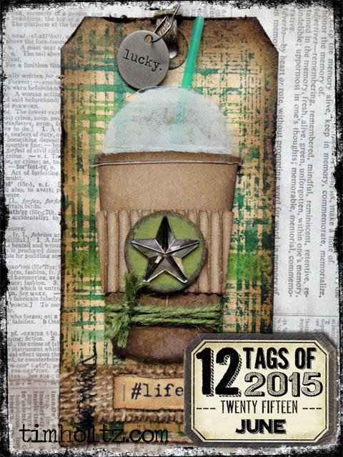
Tim's 12 Tags of 2015-June I Thank My Lucky Stars

Hello friends!

Today, I'm celebrating! I've just completed 8 months straight creating for Tim's 12 Tags Challenges.    I'm also celebrating  the fact that I've finished my June tag for Tim Holtz 12 Tags of 2015-June early! And you can bet I wrestled with this one, as I had only a few of the products, and it was difficult to find appropriate substitutes.  Please read and see here to see how the Master of Creativity, Mr. Holtz made his tag.


Here is what Tim's inspirational tag looks like:


I did have the Typed Tokens, the Tiny Attacher and Mirrored Stars, tag, paints and inks, but aside from that, I had to improvise.  After trying every one of my seemingly appropriate Layering Stencils to make a similar background, I settled on using a Sizzix embossing folder, which I inked up with my Distress minis, Peeled Paint, Forest Moss and Mowed Lawn, and used like a stamp. I was very pleased with how it turned out.

Now, I've got my weight in Tim's dies, but NO Fresh Brewed die, so I went with my  two newest additions to my  Tim Holtz die collection: Thinlits Labels and Butterfly Duo. I pretty much followed the technique with the paper piecing, with one small exception.  I added Peeled Paint Distress Paint to the clear waste packaging to high light the butterfly's wings. Picket Fence, Walnut Stain and Peeled Paint Distress paints color the spinner body.


I chose a burlap scrap in a lighter color to match my jute which I colored with coordinating Distress inks.  My sentiment is from Tim's Small Talk, and I added the hashtag.  I colored and curled up some Paper Twine (love this stuff!) using Distress ink. I used Citrus, Meadow and I think Butterscotch alcohol inks to color my stars. (The yellow star was already colored in my stash, so unsure of the color.)


That's pretty much it for another FUN, FUN tag and technique from Tim's tag challenge! I am so much enjoying the challenge each month, and thank my lucky stars we have the inspiration of the one and only Tim Holtz and his great line of crafting products to work/play with. So not only am I celebrating finishing early and 8 months straight of creating Tim's tags, I'm celebrating Tim and his amazing inspiration!


I would like to enter my tag into the following inspirational challenges:


Mixed Media Monthly Challenge #13 "A Year of Choices" I chose #8 "New to You".  My Thinlits Labels dies are brand new,  purchased especially for this project.  I used an embossing folder in a totally new way to me!


Thank you for stopping by and leaving your amazing, inspiring comments!  I read and truly appreciate each and every one of them! Hugs and Blessings!

Sara Emily

Monday, June 22, 2015

Shabby Wedding Card

Hello, crafty friends!  

Today I have a wedding card to share with you.  My neighbor's daughter got married this weekend, and I wanted to make her and her groom a special card to go along with their gift. The newlyweds will move to Japan to start their new lives together. Bess moved into our neighborhood when she was just a toddler.  She's been great to our family, helping me as a baby sitter when the kids were young, watering my flowers when we were on vacation every summer, and helping me with my Halloween parties. She's pretty special!


Jenny at Frilly and Funkie is hosting "It's Summer" challenge and wants to know what we love about summer.  I love June weddings (so Romantic!) and the flowers and butterflies in my garden and in the gardens where I work.

For my background layer I used  designer paper, added wrinkled pieces of tissue paper randomly and covered this with thinned gesso and dried. I used a hand made brick stencil to lay down crackle texture paste randomly. When dry, I added another coat of thinned gesso and dried. Using the inner oval from the die cut Ornate Frame as a mask, I added Distress paint, Worn Lipstick, thinned and swiped through puddle and allowed to dribble in cracks and recesses.The flourish image is Tim Holtz French Market inked in Watering Can Archival.


My hand cut fishtail is stamped with a Paper Garden image also in Watering Can Archival. I colored it with Distress ink and markers using a water pen. I distressed and edged with Vintage Photo Distress ink.


I cut 3 frames using Tim's Ornate Frame. I inked  one frame with Watering Can Archival, one with Distress ink Worn Lipstick and  the top layer I  patted with texture paste and dried. I added crackle paint in Picket Fence, inked with Worn Lipstick Distress ink and Bubblegum Perfect Pearl mist. I edged with Vintage Photo Distress ink.

The lattice is a Cheery Lynn die, inked with Old Paper Distress ink. The flowers are hand made using Tim Holtz' Tattered Florals die, Worn Lipstick and Vintage Photo Distress ink. I  colored the stamens  with Worn Lipstick Distress paint then dipped them in the Perfect Pearls Bubblegum mist bottle. The foliage is a Tattered Lace die, colored with bundled Sage and Mowed Lawn.


The butterflies are a 7 Gypsies  image inked in Watering Can Distress ink, fussy cut,  and colored with Worn Lipstick Marker and spritzed with Perfect Pearl mist, Bubblegum. They really shimmer in real life!


My pearls are colored with Worn Lipstick Distress paint. The sentiment is Cloud 9  inked in Watering Can archival and fishtail cut by hand and distressed with Old Paper and Vintage Photo Distress inks flicking with water.

The seam binding bow is colored with Worn Lipstick Marker and Mowed Lawn distress ink.


 I would like to enter my card into the following inspiring challenges:

Frilly and Funkie "It's Summer"

Craft Stamper Take It Make It June Challenge 'Take a Technique' Texture

Mixed Media Card June Challenge # 12 "Collage" I've also included the optional element "frame".


A Vintage Journey "Celebrations" Probably not obvious where my Tim Holtz influence comes from on this mostly pink card, other than his numerous products used here.  In addition, his techniques of painting background , crackling frame, coloring Crinkle Ribbon, Distressing, and spritz and flicking ( all bits and pieces of his past tag challenges) all came into play on my card. Celebrating a wedding!

The Artistic Stamper June's Creative Challenge "Summer is on it's Way"

Country View Challenges "Shabby Chic"

Simon Says Stamp Monday Challenge "Stamp + Mist"

I hope you will get around to each of these challenge blogs to see all the great inspiration from the Design Teams!  You will be so happy you did!

Thank you for stopping by and leaving all your lovely, inspiring comments!  I read and appreciate each and every one, and I try to respond, and visit your blog in return. Hugs and Blessings!

Sara Emily