It's time for our very first challenge at Anything But Cute! The lovely and uber-talented Branka is our hostess, and she has chosen the theme Vintage Garden. She would like you to create a mixed media project that includes something that reminds you of a garden--flowers, birds, butterflies, dragonflies, bees, lattice, vines or maybe a fence. Whatever garden vision you have, we want to see it! Just be sure it's in a vintage style!


I'm a recycler and repurposer, and love to use "junk/trash"and common household items in new ways. Some of the trash I've used on this birdhouse is foam and acetate waste packaging, grapevine wreath bits, paint chips, cereal boxes, and old greeting cards.

I started with a paper mache' birdhouse I picked up on clearance a couple of years ago.

After giving it a coat of gesso, I started "building my shed" and "planting" my garden". I made a copper roof using copper colored card stock, embossed it with Tim Holtz Stripes Texture Fade and wiped on Distress paints with my fingers (Peeled Paint, Black Soot, and Salty Ocean). I then wiped on some metallic rubs in various colors. I used the same colors on the eaves over top DecoArt copper fabric paint. My Tim Holtz influence here is in my modified Painted Industrial technique from his latest volume of Compendium of Curiosities.

Here's a shot from the top in my strawberry patch.

The "cobble stone walk" started with a Kleenex tissue (well a few of them). First, I peeled them apart so they were one ply. Then I used texture paste through a Prima stencil. After it dried, I used Gel Matte Medium to adhere it to the base of the birdhouse. This is a great way to use stencils on an uneven or curved surface. After the adhered stenciled tissue dried completely, I painted it with Weathered Wood, Black Soot, and Gathered Twigs Distress Paints to give it a weathered stone appearance.

We'll start our walk through my garden at the front window. Here you'll see some architectural elements like Victorian Gingerbread and old brick.

To give some texture to this side of the house, I stuck on some masking tape and bits of cheese cloth. The bricks are made from paper clay and a handmade brick stencil and cut to fit around the window. The roses, leaves and ivy were all made from paper clay and molds. I used Distress paints, inks, stains, sprays and markers to paint everything. I also added some random stamping using script from Tim Holtz'' Urban Grunge set and the image over the window is Cloud Nine. Some more Tim Holtz influence here using his Paint Marbling and Layering Stencil: Texture Paste techniques from Compendium of Curiosities Vol 3, modified to use on a surface other than a tag.


The window is made from two dies: Tim Holtz Window and Window Box and Sizzix Curly Gate. I trimmed the window to fit the space, and I gave it and the trim pieces a coat of gesso, followed by Picket Fence Crackle Paint. Once dry, I stamped it with an image from Tim Holtz Attic Treasures in Archival ink and dripped some Distress ink in the cracks and wiped off the excess.
The "wallpaper" is from My Mind's Eye. I've added some ink and paint and a stamp from Tim Holtz' Nature's Elements, as well as a fussy cut cat from my book "Parlor Cats". Every vintage garden needs a cat peeking out the window at the butterflies! They are cut with Butterfly Frenzy die (Tim Holtz) and colored with Perfect Pearl powders and Distress paint.

Next we walk through the potting area, where wisteria (bits cut from a large floral stem) drips down from the eaves from vines (little bits I cut off my wreath), and dogwoods hang in the background (unidentified stamp from a yard sale). I used a home made stencil for the brickwork, laying down crackle texture paste. Some random stamping done with the script stamp complete the background.

Some of the details include regular texture paste swiped through a TCW stencil for the grass, and a bluebell stamp from Art Impressions. You might be able to see I gave the bricks and the bluebells some shadowing. The birdcage is from Paper Studio, painted with Distress paints and popped off the wall. The bench is actually 5 layers of a Spellbinders die cut-- 2 for the backrest and 5 for the rest to give it some dimension. I used Picket Fence and Brushed Pewter Crackle paints and Distress paint and stain to highlight the cracks and give a shadow.

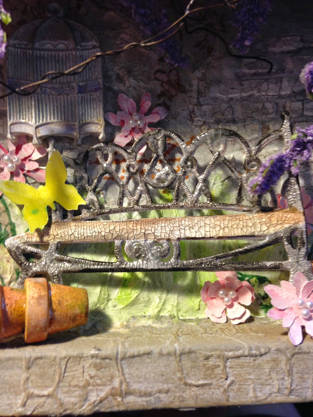
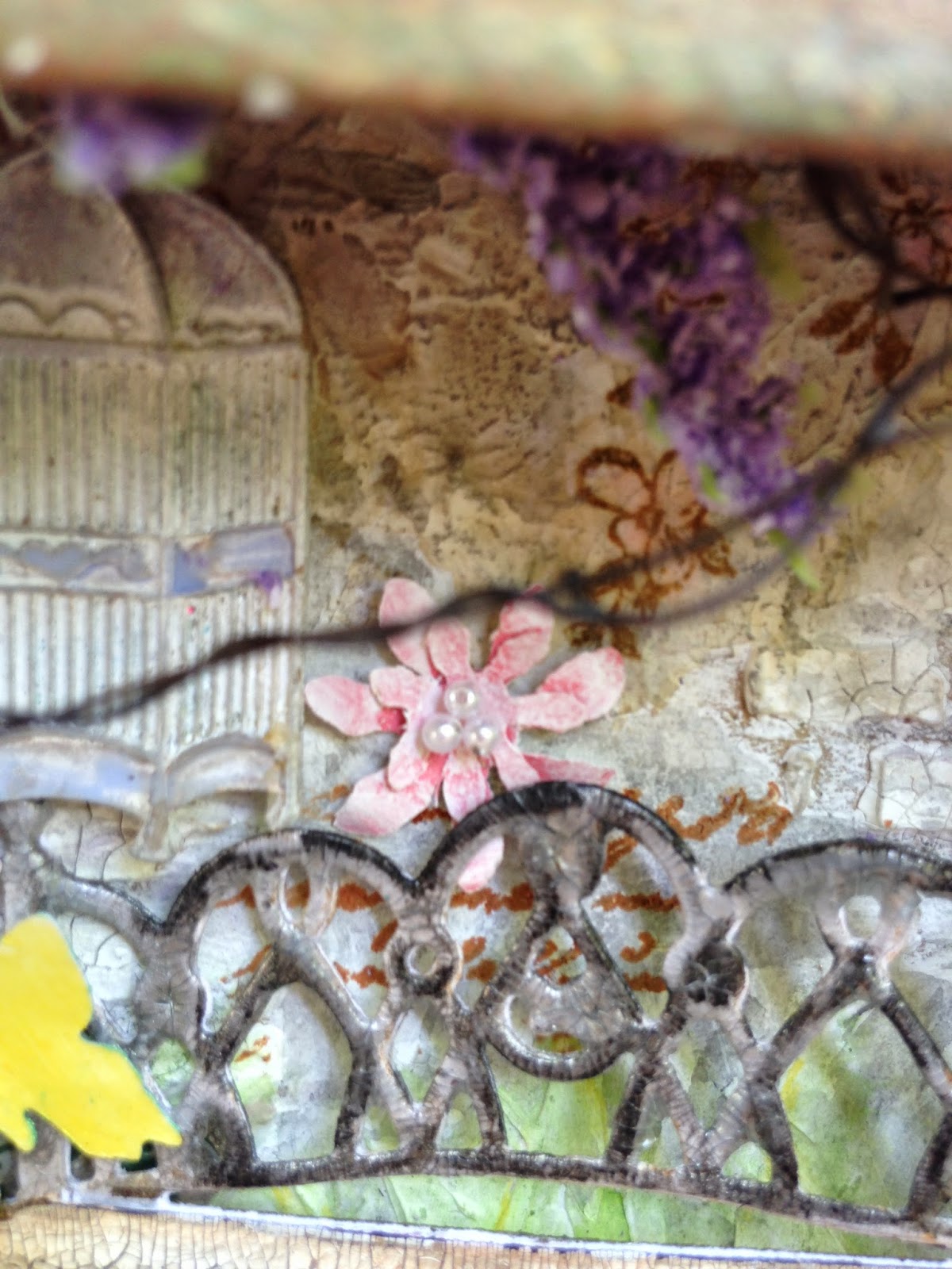

I made little flowers using Tim's Tattered Flower Garland die and paint chips and a few tiny pearls pulled off a necklace. The hollyhocks were a find at an estate sale last week--I got a big box of crafting goodies! More Perfect Pearl butterflies added!

The pots--probably my favorite part about this entire garden started out as wood miniatures. I gave them a coat of gesso, added Rusty Hinge Distress paint and some sand for texture. Once dry, I dabbed on Gathered Twigs, Wild Honey, Peeled Paint, Black Soot, and Antique Linen Distress paints.
Here is a shot I took of the process from start to finish.

And here is a close up of them on my completed project.

Let's walk around to the lathe house...This is a little whimsical, so pardon my over-sized flowers! These were also cut with the same Tim Holtz die and paint chips. Gesso gives them a vintage, worn look.


I made my lattice from a recycled greeting card. It's purple, teal and black on the reverse side! I threw everything at this puppy--crackle paint, crackle texture paste, gobs of gesso, all to give it that really time and weather-worn appearance. Distress paint and stain finish it off. You can see a little cheese cloth peeking out around the edges and between the "boards" of the lattice on the finished project.. I added a layer under there just for fun.

The bird and nest is Paper Studio, altered by moi, as is the bicycle (thanks for the inspiration Samra!). The picket fence is from Hobby Lobby, and it started out brown. Lots of gesso, Picket Fence (ha, imagine that!) Crackle paint, and stain dripped in the cracks give it a shabby look.


My vines are some of the metal vines I've used on many of my projects-purchased at a yard sale years ago. Love this versatile stuff-it can be painted any color-I used Distress paints this time.
More holly hocks and butterflies! The basket was a plain straw-colored one I picked up at a yard sale and have been hoarding for a special project. I cut it in half and painted it to add to my wall. I cut a bird from the cover of Tim Holtz' Wallflower paper stash, since I messed up the first bird cut from the actual paper. There are little handmade roses in the basket.

I bet you heard the trickle of water coming from the fountain just around the corner!

This is my favorite view of the garden, and I had a lot of fun designing it around the metal lion head doorknocker from Paper Studio. I panicked for days, because I couldn't get the horseshoe out of his mouth. I gave it to my husband, and he pulled it right out! My hero!

The bricks forming the arch are made from paper clay, and I used texture paste as mortar between them. The back of the fountain was made by applying a thin layer of texture paste through a Prima stencil on a piece of cardstock. The "concrete" blocks and the pool were made from the dense foam inserts that come in Texture Fades. Everything was painted with Distress paints, and shadows were added using watered down Gathered Twigs paint.


I added some more paper clay and handmade roses, vines, ivy, and Flower Soft. I created the pool of water from Cellophane Glitter and microbeads. The stream of water falling from the lion's mouth was made by gluing microbeads and Raindrops on Roses to a strip of thin plastic waste packaging (the wrap from Distress inks). A couple more butterflies complete the scene.


I wanted to make a base for my birdhouse vintage garden, and found this piece in my stash, which I painted with distress paints, textured with some textured Kleenex, more paint, Picket Fence Crackle paint, and Distress stains dribbled in the cracks, and wiped off. I forgot to take the before picture of the entire piece, but this one shows it's true colors on the top which I didn't paint. This is another Tim Holtz influence: Tim likes to use old vintage things in his work, and his displays, and many of them he finds out "junkin" (just like me, his soul-sister).


I guess I could have left it at the first paint layer (Distress Marbling), but NOOOO! That would have been too easy!

I was the lucky winner of a huge stack of Heartfelt Creations stamp sets from the generous Kathy Clement, and I wanted to use at least one of them on my project. Although the one I really intended to use just wouldn't fit, I made this tag (Tim Holtz Tiny Tabs and Tags die) and to hang on my house using one of the sentiments from the sets. I used Tim Holtz' technique he presented for his April tag. I used water spritzed water color paper, Distress markers and Distress marker spritzer for the background, after embossing the sentiment in clay embossing powder. Of course, I had to distress the edges and add a little spritz and flick, too, to give it a real vintage feel. I even used vintage string to tie it on the base.


Here' another quick walk around my vintage garden...


I hope you enjoyed my post as much as I enjoyed creating this little shed for you! Thank you for stopping in today, and for all your wonderful comments! I read and appreciate each and every one of them! Hugs and Blessings!
Sara Emily
I would like to enter this in the following inspiring challenges:
A Vintage Journey "Spring Colors" My Tim Holtz influence is in bold text. I am also a huge fan of his Distress products, stamps, dies, and Texture Fades and have used MANY of them here!
Creatalicious Challenges #74 "Embossing Wet or Dry" I used both dry (roof) and wet (tag) embossing.


