Sunday, July 31, 2016

Rest in Peace 12 Tags of 2016-July


Hello friends and visitors! Thank you to all of you who left such sweet comments on my blog for the last several postings. If I haven't been by to visit, I will try to soon. We have been away on vacation and came home to a few matters that needed my attention.

So here it is, the last day of July, and I've just finished my tag for Tim's 12 Tags of 2016 July challenge. Just a few more hours before the challenge closes...I hope Tim looks at late entries.


The Technique Remix this month is Watercolor Resist-Layered Words. It seems like just yesterday when I was linking up my entries for these two! Please pop over to his blog to see Tim's artful tag, if perhaps you've missed it. Complete instructions are given in his easy to follow tutorial on his blog.  I won't go into any detail on how I made this, as I pretty much followed his instructions and wow! I even had all the supplies! I did have to use a different set of Thinlit words to fit my Halloween theme.

I had to do some masking to get this to work--the dark hat didn't do much for the Layered Words technique. I ended up doing this 3x to get it to look like this. I masked off the top of the top hat with painters tape before inking, and I was extra careful to remember to remove the tape before stamping. BUT, I replaced the mask before stamping the obituaries without removing the top part of the hat, too, and ended up with a blank space--DUH! Haste makes a lot of waste!


This guy's eyes looked a little hollow, so I thought he might look better with stars in his eyes! Notice the stitching...after cursing my old heavy sewing machine for so long, I realized I had a fun little light number a friend gave me a couple of years ago and it works like a charm! I thought I would give it it's debut here today. The pen nib says memoirs, and it looks like he's written his in blood!


It may be a little early for Halloween, but I was inspired by all the new Halloween supplies Tim has shipping now. I need to clear out the old to make room for the new!

This tag was such a blast to make, so even if Tim doesn't look at the late entries, it was worth it just to have a bit of crafty fun and stretch my Halloween muscles again. I wanted to photograph him with some caskets I made using some Distress products, but time was running short to get this posted.  You can always view them herehere, and here if you have an extra minute.


I'm sharing this tag with the following challenges:
Country View Challenges July Challenge Have Fun With Circles I have one circle unless you count the eye sockets then it's three:):).

Thank you for stopping by today and for all your lovely comments!
Hugs and Blessings!
Sara Emily

Thursday, July 14, 2016

Guest Designer for A Vintage Journey-Monochromatic Canvas

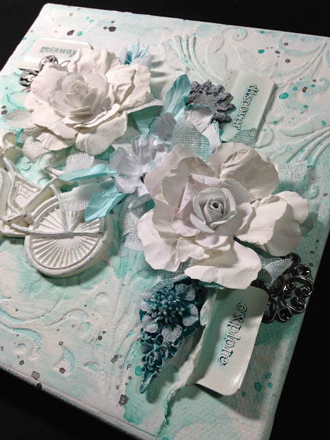
Hello lovely friends and visitors! I'm excited  to be Guest Designer at A Vintage Journey today for the talented Tracy's challenge theme "Monochromatic"! For her challenge I've chosen to make a shabby canvas.


I love creating monochromatic projects, and usually the toughest part is deciding on a color! I went with teals/turquoise this time, and my inspiration was the resin embellishment I picked up at Hobby Lobby at the bottom right hand side. Hopefully these colors will cool us off! It's been notihing but HOT, HOT, and more HOT here!


Because my canvas claimed to be triple coated with gesso, I got right to work. I laid down some Golden Crackle paste through Tim's Flourish Layering Stencil and cut the Flourish  from his Mixed Media #2 die which I adhered with gel medium diagonally from the pasted flourish. I gave it all a coat of gesso at this point and allowed it to fully dry. I painted on Distress Tumbled Glass and spritzed with water to blend. While wet I flicked on rubbing alcohol and dried.  I added more layers following the same technique and added Distress crayon in Peacock Feathers around the edges and smudged. Because it was too bold for my liking, I scraped gesso on with a piece of chipboard and scraped that back when partially dry.  In doing so, I lost all my crackle. I splattered with a watered down guache mixture of blue and turquoise, watered down black guache, and also watered down DecoArt Titanium White. I made  shadows with watered down guache in turquoise.


I made some flowers with my new Shabby Posies die by Tammy Tutterow and Tim's Tattered Florals inked with Tumbled Glass. Smaller flowers were made with the Tattered Flower Garland die and colored with Peacock Feathers crayon at edge and Peacock Feathers ink. A single black half pearl with gesso stands in for the center. I cut a few from crinoline and these were painted with titanium white and a hint of Tumbled Glass. The larger posies have centers of beautiful tiny roses gifted to me by  blog buddy Samra of Paper Talk With Samra. She makes the prettiest flowers! These work perfectly with the posies--thank you, Samra! I colored the flowers with Titanium White to unify them, since they were made from different card. I never knew there were so many shades of white! The single Tiny Tattered flower tucked in at the top of the spray is leftover from a previous project.


Gesso was patted on two metal flowers from my stash.  A third metal flower was already painted a deep green. In an attempt to unify it with the others, I covered it with black gesso and patted with silver metallic paste and then patted with white gesso,

Check out those old metal word file tabs! They were the rage at one time. The price tag tells me they were just 49 cents on clearance at Michaels,  and that was years ago! I simply altered them by cutting off the back flap and coloring them with the Distress Crayon--easy peasy!

The resin bicycle was first painted with the Distress crayon just on the frame, followed by a pat down with the Titanium White on a make up sponge. Just a hint of color shows through.


The blue resin flower embellishment that inspired the whole canvas was patted with white gesso to show off the detail.


Here's one more look at my shabby monochromatic summertime canvas. I would like to thank Nikki and the entire panel of Creative Guides at A Vintage Journey for inviting me to be Guest Designer for a day here at one of my favorite challenge blogs! I am truly honored! I hope you will enter your monochromatic project this month at A Vintage Journey--you just may win a generous gift certificate from The Funkie Junkie Boutique!


I'm sharing this canvas with the following challenges:
Scrapy Land Challenge #45 - Anything Goes I used Spellbinders and four different Sizzix dies.
Country View July Challenge-Have Fun With Circles circles on my bike-the wheels! Circle s in splashes and splatters. Circle shaped flowers and at the center of the flowers, Circle shaped formed by the flourishes.
Frilly and Funkie All Lined Up My lines are on the spokes and basket of the bicycle, in the dots on the file tabs, and in a grid pattern on the crinoline. I hope it's OK my lines are going in EVERY direction on the wheels!

Thank you for stopping by today and for all your fabulous comments! I read and appreciate each and every one of them!
Hugs and Blessings!
Sara Emily


Tuesday, July 12, 2016

United We Stand


Hello friends and visitors! I have layout for you today to celebrate unity between neighboring countries and to honor the friendship I have with many bloggers to the North. I was going for a Folk Art look. Emerald Creek Dares is having a challenge to celebrate nations, and I wanted to blend the borders between Canada and USA with my project. That blob you see on the upper right is Canada and USA!


Lots of layers on this and plenty to look at; I really piled it on! I've got corrugate board for the base,  American flag scrapbook paper, and hand designed card. I threw in a couple of Tim's Pocket Cards for some good vintage fun.

There's stenciling using Tim's Stars and  stencils I made using  the negative from Tim's
Fall  Foliage Thinlits -- maple leaf die and a maple leaf punch.


For the focal layer, I started off with a mop up piece.  I had stenciled some stars with cracke paste (I think) and run through some leftover Blueprint Sketch ink puddle. It really looked terrible, and probably should have gone in the round file, but I keep everything! I was able to salvage it by heat embossing the stars using Emerald Creek's Clear Matte Embossing Powder and then spraying with Distress Abandoned Coral Spray stain. I added Barn Door ink randomly for depth. and embossed sparklers with an old stamp and Emerald Creek's Easter Parade Embossing Powder--it's not just for Easter! You can see just a hint of the shimmer, but it's quite sparkly in real life! I stamped and embossed the sparkles on the bottom most American flag layers, too--you can just barely see it in the photo above. I heat embossed in white on the top American flag layer by using Ranger's embossing dabber  on the reverse side of the stars stencil and flipping it onto the paper before sprinkling with powder. It doesn't look like much since it's all but covered up, but it adds some shabbiness to the scrapbook paper. The corrugate and scrapbook paper layers were each given a coat of Distress  Vintage Collage Medium.


The maple leaves were die cut and painted with Barn Door Distress paint and the tips heat embossed with Emerald Creek's Burnt Copper Leaves Embossing Powder.


I fussy cut around Canada and United States from one of Tim's pocket cards and inked with Barn Door and Blueprint Sketch. Sorry, I had to leave our Alaskan and island and more Northern Canadian friends off, but I think you can understand why!  But you are included! A Chit Chat quote typically uttered by the Americans is meant to show my friendship toward our friends across the border, and I blurred the lines of the border as another way to say we are united.


To the right you see one of the Pocket Cards put to use and to the left I heat embossed stars and maple leaves (only one showing here) using the Clear Matte. I painted the  corrugate  background using Barn Door and Chipped Sapphire Distress paints after coating the board in gesso and embossing.


I colored some file folders with Blueprint Sketch Distress spray and Barn Door Distress ink and a tiny bit of  Frayed Burlap ink and die cut two tags using Tim's Tiny Tabs and Tags and Tag and Bookplate dies. I painted a cotton scrap with Barn Door and the punch stencil  and some vintage seam binding using Distress inks in Chipped Sapphire and Barn Door.


I want to stress this is NOT a card! It is quite large, measuring approximately 8 by 11 inches. It is also quite thick as you can see by the photo below.


I am sharing this with the following challenges:
Scrapy Land Challenge #45-Anything Goes I used 3 different Sizzix dies.


Thank you for stopping by today and for all your wonderful comments!I read and appreciate each and every one of them!
Hugs and Blessings!
Sara Emily

UPDATE: Tremendously honored!

Honorable Mention at Emerald Creek Dares :)

Saturday, July 9, 2016

Ultramarine Seahorse Birthday Card

Hello friends and visitors! I had so much fun making my shades of red seahorse card, I decided to make one for my son's birthday in some of his favorite shades.


The background was made by applying thick gesso  to a card and then dragging a texture tool through it. I used various shades of Distress paint in blues, followed by some splatters of  watered down white acrylic paint, ultramarine and lake blue guache. I seriously love working with this medium. The bubbles are Distress Picket Fence using different sized straws for my "stamp".


I used the Mixed Media #2 Thinlit die for the green "seaweed" and applied Distress Crazing Medium to it for the tiniest cracks. I used a variety of sprays, inks, and paints to color it. I stamped the seahorse with a My Sentiments Exactly stamp in Archival, Jet Black, fussy cut, and applied a coat of DecoArt Crackle Glaze. When dry I colored it and highlighted the cracks with Distress and Decoart paints and Antiquing Creams. I say creams, because this was an entirely different color before! Did you know seahorses can change color in real life? Mine started out red (leftover from my previous project), but it changed color to blend in with his surroundings, just like they do in nature. You can see just a hint of the reds showing through. Oh, and ignore that little thread; I was trying out some cheesecloth, but didn't like the look.  I guess a thread got stuck.


This seahorse was also stamped with same image and fussy cut.  I gave him some texture using DecoArt Sand Texture paste, Golden glass bead gel and Wendy Vecchi Crackle paste. I colored him with Distress Twisted Citron spray stain and  Distress paints, Cracked Pistachio and Evergreen Bough. I also splashed on some watered down guache in blues. The little guy is an All Night Media stamp, fussy cut, coated with the same mediums for texture. He is colored with Cracked Pistachio and splattered with Twisted Citron.


The white "seaweed" is Memory Box Cloe Stem and Tim Holtz Festive Greenery die cuts. I added a Chit Chat sentiment to finish it off. The card was adhered to a background stamped with a Prima rope image. Here's one more look at my completed card.


I made this card especially for my son--we'll be celebrating 18 years this coming week! and for the following challenges:
Scrapy Land Challenge #45 Anything Goes I used two Sizzix dies and a Memory Box die.
Frilly and Funkie All in the Family This card was made to celebrate a family member's birthday.
The Artistic Stamper July's Creative Challenge-All Things Bright and Beautiful It's not obvious, but I used 2 seahorse stamps and I stamped with straws (circles).
Happy Little Stampers HLS July Challenge-Recycle I recycled my stamped and crackled seahorse. He was red and I was able to change him to the color seen above. (Not sure if that counts-feel free to remove if this doesn't qualify.)

Thank you for dropping in today and for leaving your lovely comments! I read and appreciate them all!
Hugs and Blessings!
Sara Emily

UPDATE: So honored!


Friday, July 8, 2016

Good Things...Monochromatic Seahorse Card

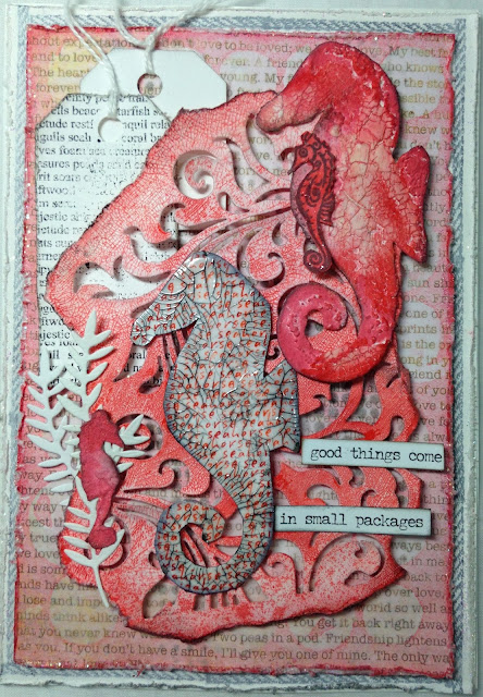
Hello friends and visitors! I have another monochromatic card for you today, this time in shades of red and featuring a sweet little seahorse family! As you probably know the males bear their babies and carry the unborn young in a pouch on their abdomen. So the red seahorse is the Daddy here. Seahorses are also monogamous, mating for life.


The background was made following a tutorial posted by Jenny Marples at Pushing the Right Buttons using a Tim Holtz  Splotches stencil and Ranger Transparent Texture Paste in Matte. Jenny makes the most incredible backgrounds, and this one looked like one I might even be able to do. I'm not completely satisfied with the way mine turned out. In Jenny's example, the patterned paper appeared to be covered by the ink, but even after several layers of ink, mine remained translucent. The patterned paper from my stash had some "distressing" on it, and it came out a little yellow looking in those areas once the paste dried. This doesn't show up so much in real life, so I think this still qualifies as monochromatic.

I used Abandoned Coral Distress ink to color the background and edged in Festive Berries.  I added some more random stenciling using Tim's Faded Dots stencil for "bubbles". I distressed and heat embossed the edges of this panel  and the panel below it with Holographic embossing powder. You can see I also stamped a rope image from Prima on the bottom most panel. The Chit Chat sticker sums it up...

.

A Flourish die cut from Tim's Mixed Media #2 set was torn around the edges, and I added Distress Crazing Medium, then sprayed with Abandoned Coral Distress spray stain when dry.  I added Festive Berries ink here and there to give it some depth and edged with Black Soot. The tag is a My Sentiments Exactly stamp and fussy cut. I hand cut a second tag.


I stamped four seahorses and fussy cut them. The two larger images are My Sentiments Exactly, and the smaller image is All Night Media. I stamped this one in Archival Vermillion ink and gave it a coat of DecoArt Crackle Glaze. When dry, I highlighted the cracks with DecoArt Antiquing Cream in Carbon Black and edged in Jet Black Archival ink.


I gave the other larger seahorse a coat of DecoArt Sand Texture paste, several coats of gesso, some crackle paste and Bead Gel medium. I got a little impatient and gave it a blast with the heat gun and made some grungy bubbles. That's OK, though--in my research on seahorses, I saw that most of them get pretty grungy at the bottom of the sea. I colored him with Abandoned Coral. Festive Berries and Barn Door inks and edged in Black Soot. His baby is inked with Abandoned Coral and coated lightly with Rock Candy  Stickles for a little sparkle. Seahorses take on the color of underwater plants to avoid predators, and mine are blending right in!


The little baby's older sibling was covered in Sand Texture paste and a coat of gesso and Abandoned Coral ink. He isn't mimicking his surroundings, and he stands out against the "seaweed" (Tattered Lace Ornate Leaves die cut). I hope you've enjoyed my little underwater family of the sweetest sea creatures!  I had so much fun making it!


I am sharing my card with ....
Scrapy Land Challenge #45 Anything Goes Dies used Tattered Lace and Sizzix
Southern Ridge Trading Company-Anything Summer I always think sea themes as summery and I used summery colors. Shhhh! It's for a summer birthday!
Mod Squad Challenge Lazy Days of Summer What could be lazier than floating around in the sea?
Creative With Stamps CWS Challenge #4-Ink Splatters Mine come in the form of splatters from the spray stain on the Mixed Media #2 die and the splotches in the background.

Thank you for stopping in today and for leaving your wonderful comments! Iread and appreciate each and every one of them!
Hugs and Blessings!
Sara Emily