Saturday, October 24, 2015

Something a Little Less Sinister

Hello crafty friends!

You might have noticed I love Halloween!  From the looks of blogland, I think there quite a number of you out there that share my love of Halloween crafting.  What wonderful inspiration is coming from your blogs this month--I love it! So, thank you all for sharing your fantastic creativity and all the inspiration!

I decided to go a little less sinister than my last project, and have a little fun with Halloween. I'm going to leave the how to up to your imagination, for the most part, but if you have specific questions, leave them in your comment and I will respond.


This started as a cheap piece of little girl's artwork. It is a "canvas" on a thick wood frame--I hope the wood frame part makes this fit into the wood theme at Mixed Media World! I pulled off the backing, but left the so called canvas. I had to give it a good coat of DecoArt White gesso, because it was bright pink, and purple! I still remember Barbara giving a pair of these to me last Halloween.  She said she knew I would make something really creepy with it.

I've had the mirror for a couple of years, and each year I try to do a  gel medium transfer on it, and it never works...I think it's all the accumulated dust that's gotten on it or maybe because I'm IMPATIENT.  I tried one more time, and this time it worked...well it's ok.  I used some ink after the image transferred and dried to give the skull some color. The sentiment (Hobby Lobby) and spider web (Tim Holtz) are inked with Staz On. I flicked some Distress ink in Barn Door on for subtle blood spatter. I added the yardsale mustache for fun. Crackle paint and DecoArt Media Antiquing Creme in Raw Umber give a little extra creep to the mirror frame. (yippee, I finally got my order with the new DecoArt Media Antiquing Cremes in it!)


I used DecoArt Modeling Paste through Tim Holtz stencil for the background and sprinkled on some Distress and Wow Embossing Powders while it was still wet. Then I melted with the powders a heat tool when the paste had dried.


DecoArt black gesso on the plastic crickets, followed by more DecoArt  Antiquing  Cremes in Medium Grey and Raw Umber. Crickets are the epitome of creepiness, in my opinion; far worse than spiders, and I'm happy to get them out of my jar of plastic insects. (These were my kids when they were little, and I saved them from the annual yardsale)!

The little skull is left from another project that just didn't need one more skull.  I added some DecoArt Antiquing Creme in Raw Umber.

I made the top hat  out of waste packaging using the pattern in my imagination.  I rubbed some Ranger Perfect Ink Refresher into the card to make it supple and gave it a good beating to age it a bit.  Paint, crackle paint, and DecoArt Medium Grey Antiquing Creme finish it off.


I added a few bottles from my vintage bottle collection to balance out the scene.


I used wide raffia  to wrap around the sides and over the staples on what is now the front of the canvas. This was inked and painted to show off the texture and to make it look like rough hewn wood. The inside of the canvas and the wood frame are painted with Distress paints to match the background, but that is kind of lost now.

Around back, I brushed on some DecoArt black gesso.  When dry, I  repeatedly stenciled spider webs with Tim Holtz' Shattered stencil and paint and Dyslusion spray in White Linen. This was done in layers, drying between layers.


I would like to enter this into the following inspiring challenges:


Thank you so much for your visit today and for all  your lovely comments!  They really make my day, and I try real hard to get around to your blog to repay the visit and because you are all so inspiring! Hugs and Blessings!
Sara Emily


Wednesday, October 21, 2015

Decay and Spiders! BEWARE!

Hello friends!  Well, I hope we'll still be friends by the time you're done looking at this!  My project is more than on the dark side, but really made in good fun! Chris, you might not want to go on...

What's lurking in your backyard?  Or maybe in your basement, if you have an old house like ours??!  After all the recent flooding here, things got a little soggy in our garden...and this is what popped up!


It all started innocently enough with a styrofoam skull I picked up at Michaels.  I REALLY would love to win some DecoArt media products, so I thought I better have another go at  DecoArt Mixed Media Haunts Challenge.  I only have 4 DecoArt Media products-Media Gesso in black and white, Media Crackle Paste and Media Modeling Paste, so I thought I would make the most of them.  Lucky me, a friend lent me some of her Liquid Glass, too, so really  5 of these wonderful products were used on my project. And after using what was left of my Modeling and Crackle pastes,  I can now say I have only two DecoArt Media products left!  So I have all my fingers, my legs and my eyes crossed that Mr. Skinner will not be too creeped out by my project. Tee Hee!


 I wanted to do something just a little different with my skull, so I got out my hot craft knife and got to work with  a little oral surgery. I found a set of kiddie vampire teeth in my Halloween stash, and thought that might jazz him up a bit. Not quite skilled at using my knife (ages old, but only used once), I really made a mess out of my skull. Should have taken a photo, because it was really horrible what I'd done to the poor fella.

I glued in the fangs and did some repairs around his mouth using a mixture of  DecoArt Modeling paste, black gesso, acrylic paints and soft gel medium. Not too bad; my malpractice insurance might not go up after all!


I gave my skull a good coat of DecoArt black gesso, and let that dry.  I added Decoart Crackle paste in thin and thick layers and got this fantastic crackle. I like the way the black gesso shows through the thin areas and the cracks.


 I  headed back to my local craft store, because I remembered they carried DecoArt  Creme Wax.  None of our local stores offer products from the Media line, and it's too late for an online order, but I do love how the Creme Wax shows off the cracks while giving my skull an aged look. This was taken in progress.


Next I made a mud out of Modeling paste, black and green acrylic paints and a tiny bit of water and added some cut up medical gauze.  This makes really incredibly gross rotted hair and rotted eye sockets. I molded this to the.skull and when dry, reinforced it with some glue. I added a little glow in the dark paint to the socket, and that ups the gross factor.


I started out using a styrofoam eyeball (party favors left from a past party), but felt that was lame, and I wanted the look of it hanging out of the socket.  I made mine from paper clay and acrylic paints, and gave it a coat of my friend's Liquid Glass. The iris is from Tim Holtz Regions Beyond paper stash.


This poor skull looks so lost without a body, and I wanted to use a little wood on my project so I could join in the fun at Mixed Media World's Anything Goes with Wood challenge.  I found these 3 pieces of wood in my stash, and a few wood discs.  I piled them up and thought they resembled a spine.


 I gave them a coat of black gesso, followed by Crackle paste and the Cream Wax as I did on the skull.  I used black gesso on the discs, as well, but they just didn't look like the cervical discs I was going for.


 I found four wood rings in my stash already coated with black glitter; leftovers from another project.  I added regular gel medium mixed with a couple of drops of Dylusions sprays in  Fresh Lime, Chopped Pesto, and Black Marble and slathered that on for the look of rotting cervical discs.  I also used this on some plastic cord for the nerve roots.  By adding a little blast from the heat gun, which makes it bubble, I was able to make this extra disgusting.  I mixed up more of the gel medium, modeling paste and black gesso, leaving out the green paint for some rot on the vertebrae, and when dry, added some of the gel medium/spray mixture. A little glow in the dark paint was added randomly to the spinal discs and nerve roots.


Not too bad, but a spine can't just hang there.  I found a wood plaque that looked just like this (a slightly different shape because these are real wood slices) in my stash. I gave it a coat of the same blackish mixture used on the vertebrae and added some rubber worms. I thought it looked a little flat, so I added some antiquing cream to bring out the texture. No kidding, after our flooding, I found a real worm about 9 inches long, and fat!!! Yuck!


A spider web die cut (Tim Holtz) out of wax paper and a few plastic spiders coated with black gesso finish off this horrible anatomical section. The web looks so lifelike when it blows in the breeze.


 I took a few shots of him hanging out with some of the guys in our front yard.


Looks like they shared a few good laughs...


And at night he parties...


Look me in my one good eye and tell me you're NOT terrified!


Wwha!ha, ha, ha!

I would like to enter my repulsive project into the following inspiring challenges:
Thank you for visiting today and for all your heart warming comments! I promise I won't be so gruesome with my next project! 
Hugs and Blessings!
Sara Emily

UPDATE: They like it!


And so does Mixed Media World!!!
WINNER

And Emerald Creek Dares!!!

Monday, October 12, 2015

Fall Foliage Watercolor

Hello everyone!

It's time to celebrate some autumn color, so I made a card using some leaves from my maple tree in front of my home.  That particular tree still has green leaves on it, and usually just turns brown.  But with the help of some Distress inks and paints, I can dream! I will apologize up front for the washed out photos.  This would be pretty in the sunlight, but I'm not sure we are going to see much sunlight today.


I made my background by using my leaves as stamps, using Distress inks and watercolor paper. I simply inked the most textured side of the leaf patting the ink pad directly onto the leaf, and spritzing the inked leaf with water.  I laid the leaf on the paper, covered with a paper towel to absorb any  excess color  that seeps out from under the leaf.  Then I ran my brayer over to transfer the color.  In some cases, I layered the color, and in others, I gave the transferred image another spritz of water to blend it a little.  I gave each transfer a blast with the heat gun to prevent blending of colors of subsequent inkings.  I used Ripe Persimmon Distress paint on some, because I don't have that color in ink. Once I was happy with the look, I carefully blended color  around the leaves using Bundled Sage, Tumbled Glass and Hickory Smoke Distress inks. I flicked on some water and dried with the heat gun. A final touch is using Vintage Photo Distress marker with the Marker Spritzer. There's one of my favorite water coloring techniques and I didn't even need a brush!

I had to take some shots before I put the card together, because I just think it's so pretty! Click on any image to see detail. I love the change of seasons with the fall color.  It's just a shame we don't get much color in our neck of the woods.


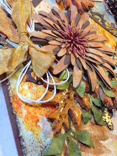
The frame is Spellbinders, and I added some Frantage.  The flower is die cut from an OLD Sizzix Daisy die, cut from card colored with Distress inks and the same brown card as the frame.  I added a flower from my stash to the center.  I purposely layered the flower petals off center to hopefully appear more realistic--I was going for a Mum.


I made the leaves from paper clay and a Martha Stewart mold.  I colored them using Distress inks and a little water.  Once dry, I added Rock Candy Distress paint, and allowed that to dry.  I added a little Vintage Photo Distress spray to high light the cracks.


The green foliage is a Tim Holtz die cut from card colored with Distress inks.  The ribbon is dyed with a variety of Distress products in yellows and oranges (sorry, I can't recall exactly which ones). The twine is Maya Road which I purchased earlier this summer from the The Funkie Junkie Boutique, but forgot all about.  This stuff is the BEST!  I have a drawer full of twine, but I'll probably not use any after using this.


I finished the card off with a quote from Tim Holtz Small Talk Occasions stickers--a more recent purchase from The Funkie Junkie Boutique. And a perfect quote for Nancy's theme at Frilly and Funkie--Autumn Splendor.  Inside, a pile of  Tim Holtz foliage on a stamped image (I don't know the maker, sorry). I cut the foliage and nuts using snippets of paper from the front of the card. This is the first time I've used this die, but now I want the latest Thinlits Foliage die! Oh, it's a good thing our wants won't kill us, and our real needs are always met!


I would like to enter this into the following inspiring challenges:

Pixie Snippet's Playground Week # 198 My snippets are that pile of foliage inside the card, all from papers created for the front of the card.
As You Like It "Monochrome or Colour (and Why?) Definitely COLOR!  Right now the favorites are fall colors of oranges and browns.  Why?  These colors make me happy! In my text you will see we don't get much fall color hear, so I have to "make" it!
Vintage Stamping Challenges # 37 Use a Die/Dies I used 4 dies on this card, and the stamping as a focal image is done with a leaf!  Your rules read to use some sort of stamping!  Also stamping inside the card.

Thank you for stopping by today, and for all your wonderful comments!  I appreciate each and every one of them! Hugs and Blessings!
Sara Emily

Yippee!!!
Top 5 winners please grab our badge

How Exciting!