Showing posts with label Prima. Show all posts

Wednesday, May 16, 2018

#sealover Tag with Tim Holtz, Graphic 45, Prima, and Seth Apter's Baked Texture


 Welcome friends! Thank you for joining me today! It's time for the Funkie side of the Frilly and Funkie team to share some inspiration for our current challenge 'Surf's Up', chosen by our very creative Frilly teammate, Kathy.

Kathy details her challenge: Who's ready for a little sand, a little sun and a little surf?  Let's take this challenge for a stroll beside the shore!  Create a vintage or shabby chic project with a beachy theme.  Use ocean colors and beach images to add a fun seaside feel to your project.

Rather than seaside,  I went into the sea with my Tim Holtz Etcetera Mini Tag!


I chose the Graphic 45 Sun Kissed 8x8 pad just for this one beautiful paper to use on this project, but the pad is just loaded with gorgeous designs perfect for a beach themed album, card, folio or just a mixed media piece like this. I used collage medium to stick the paper down, trimmed and sanded the edges, and gave it a coat of clear gesso. I blended the edges with various Distress inks, going darker at the bottom. See those cute sea turtles? They are fussy cut from another of the papers in the pack and added to my scene to float off to deep unknown places in my imaginary sea. I added shadows with Frayed Burlap Distress ink. Maybe when they go deeper there won't be any shadows. 


 The reinforcing ring that comes in the tag pack was coated with gesso, and I stamped the cheesecloth pattern in Cobalt Archival ink to make it blend with the background pattern.


I made the crackled 'seaweed' in the back by swiping crackle paste through a Mini Layering Stencil over Plain Tissue Wrap painted with Prima Sparks Fairy Wings acrylic paint. If you think you see more shimmer, it's because I swiped on Prima's Vintage Silk Opal Magic Wax over the dried crackle. The sea anemones and other seaweed are die cut using Tim's Funky Floral #3 set. They were colored with Prima Coral Reef and  Fairy Wings acrylic paints. Some seaweed was cut from Oxide scraps I had laying around.
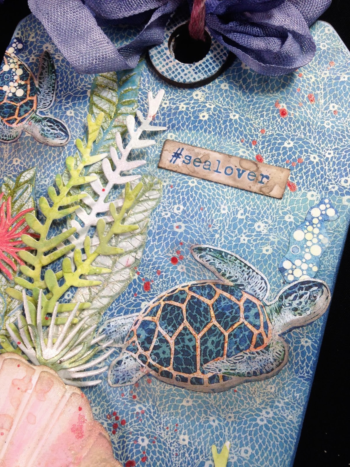

My title is inked in Cobalt archival on a piece of the business card Linda includes on those wonderful little thank you gifts she sends along with your Funkie Junkie Boutique order. Waste not, want not.  I dipped it into a puddle of Frayed Burlap Distress Oxide.


The shells are die cut using Tim's Seashells Bigz die and textured using the included seashells Texture Fade. That crusty texture on the scallop shell is from Prima's clear crackle paste, and the color is from Worn Lipstick, Tattered Rose and Frayed Burlap Oxides. In real life it has a shimmery sheen from  Vintage Silk wax, but sadly the camera  didn't pick up that incredible pearly iridescence.

My ocean 'floor' is made with Seth Apter's Baked Textures, Deep Sea and Dirty Sand. (What could be more appropriate?)


I don't know if true solid blue shells exist in nature (I see blue tones in the real shell below), but I took a little artistic license here making a blue shell colored with Faded Jeans and Blueprint Sketch Distress inks, touched with Worn Lipstick and Tattered Rose Oxides. Both shells are edged in Frayed Burlap Distress ink. If you are looking for more ways to color your seashells and tips on how to shape them, please take a minute to check out my tutorial at Frilly and Funkie, where I've used a plethora of Distress products to make some realistic and not so realistic sea shells. No two seashells are alike! I can't wait for Tim to come out with a smaller Thinlits version!

All that was left to do was to splatter with a little Coral Reef paint and tie on a seam binding ribbon bow I already had dyed in my stash (pretty sure it was dipped in Blueprint Sketch ink) using Tim's Linen ribbon dipped in Worn Lipstick Oxide.


I hope you are inspired to join in the Surf's Up challenge at Frilly and Funkie. Please be sure to stop by the blog to check out the details of the challenge and the amazing sea themed inspiration by my Frilly and Funkie teammates, and then it's over to YOU! I can't wait to see what you will create!

I'll be sharing my tag with these challenges:
Simon Says Stamp Monday Stencil It I used a mini layering stencil for some of the seaweed.
The Artistic Stamper May's Creative Challenge - Backgrounds I used two stamps--one on the reinforcing ring and one for my title. My background was collaged.

Thank you for stopping by today and for all of your AMAZING comments!
Hugs and Blessings!
Sara Emily 

The following products were used and are available at The Funkie Junkie Boutique:


Wednesday, January 24, 2018

Grungy Mixed Media Altered Frame with Tim Holtz, Prima, and Ken Oliver


Welcome! Today the Funkie side of the Frilly and Funkie team get to present their inspiration for the current challenge  at Frilly and Funkie.  Our talented hostess Suzz has chosen the theme "The Year of....."  She says, "Welcome to a brand new year!  I am not very good at New Year Resolutions but I do like to think about what I want to focus on in the New Year.  To help me do this, I pick a word that is my word for the year and try to use that word to keep me focused on what is important. The challenge to you is to  pick a word that will be your inspiration for 2018.  Create a vintage or shabby chic project that includes your word of 2018.  The word can be part of a sentiment, phrase or stand alone on your project as long as it is featured somewhere in your art."

-
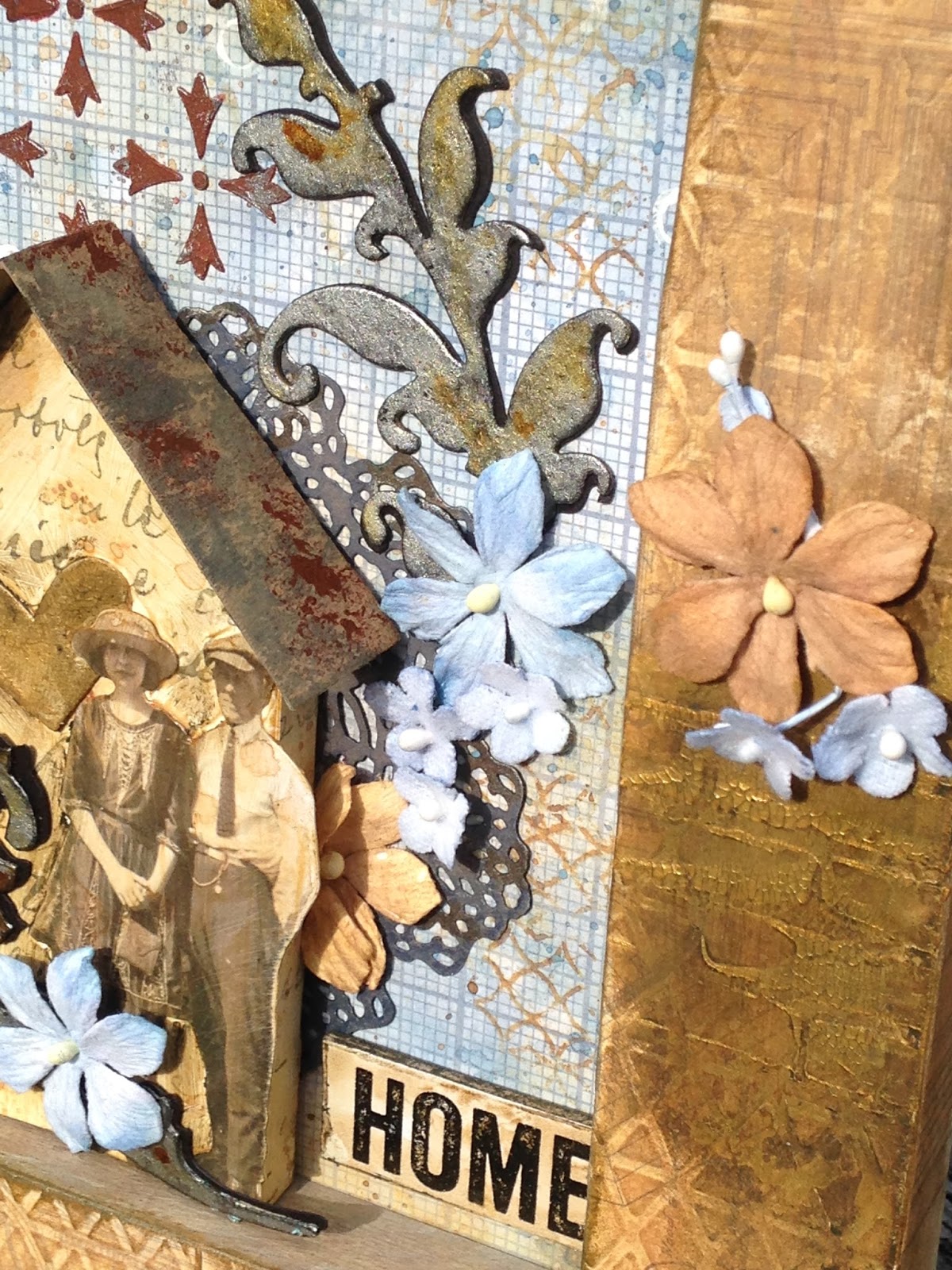
I never knew how difficult it would be to chose a word to focus on for the year; I guess I never really thought about it. Initially my mind went to 'Intention' as to live life with intention, but I'd just posted my project, "Intentions", and it seemed a little redundant. The word 'home' kept coming to the surface, because my husband and I have been working on a plan to downsize in a few years. So not only do I intend to focus on working on our house alongside my husband, but to focus more on the people I love who live in and visit our home.


I chose an old canvas from my stash and removed the wrapped canvas by pulling out the (many, rusty) staples. I painted the inner edges with two coats of gesso and adhered an old Tim Holtz paper with house blueprints to the outer edges and face of the frame.


 Before adhering the paper to the face of the frame, I embossed it with Tim's Lattice Texture Fade. After the papers were adhered, dried, and sanded, I applied a wash of Burnt Orange and Burnt Umber Color Bursts with a soft paint brush to the outside edges and face of the frame. I swiped Prima's gold Crackle paste through a Wendy Vecchi bricks stencil, and when dry blended with Walnut Stain Distress Crayon. Lastly I smeared on more Rusty Paper to make it work with the background.


 I wanted to make the inner edges of the wood frame blend with the back panel, and colored with Distress stains in Stormy Sky and Picket Fence, but I really didn't like how it looked. I ended up mixing up some more Color Bursts in the same colors as the rest of the frame and applied it with my finger. The Picket Fence stain was still wet, and it all blended into the perfect vintage chalky finish. Yippee for happy mistakes!


My background is from Tim's Correspondence Paper Stash, colored with Distress Oxides -- Faded Jeans and Vintage Photo. I used his Crossed Stencil with Light Modeling Paste mixed with Viva Rusty Paper and lightly touched stenciled areas with Prima Metallique wax. I did some background stamping with Oxides and Tim's Lattice and Flourish stamps and also with chalk paint and a pen cap.


I cut a Tiny House from another paper from the Correspondence pad and inked with Antique Linen and Vintage Photo DOX. The roof is thin chipboard inked with Black Soot and Walnut Stain DOX and smeared with Rusty Paper. I assembled the house and realized it needed to be thinner to work with the depth of my frame. I cut the back off and scored the sides midway, so the back flap could adhere to my background. To support it I added  scraps of foam core and thick cardboard to the back side of the house. The roof was also cut to fit the depth of the house. See? I'm already working on downsizing our home!


I adhered the happy couple and Heartfelt die cut with Distress Vintage Collage medium and scribbled and shaded with Distress crayon.


The scroll die cuts were colored this summer when I was so blessed to have a play date with my friend and team mate, Autumn. I've been hoarding them for the perfect project. I backed them with a second set of cut from black card. I backed the house with a Tim Holtz doily die cut. My flowers are Color Your Own by Little Birdie and Tim Holtz Bouquet. Both the flowers and Clippings Sticker were colored with Distress Oxide. "Home" is a quote chip distressed with DOX and crayon.


Have you chosen your word yet? We would love to see how you portray your special focus word for 2018 in a vintage or shabby chic project and enter our "The Year of" challenge! Please check out all the details and even more inspiration from my Frilly and Funkie teammates at Frilly and Funkie.


Thank you for stopping by today and for your lovely comments! They mean so much to me!
Hugs and Blessings!
Sara Emily

The following products were used on this project and can be purchased at The Funkie Junkie Boutique: