Friday, March 31, 2017

Silent Night, Crafty Night

Hello crafty friends and visitors! As you might recall, I made a little promise to myself at the beginning of the year to make at least one Christmas card per month so as not to get myself all jammed up at the end of the year. Well, it may be the last day of March, but I've made it (after a late crafty night).

A couple of my closeups were taken at night in poor light. There are a lot of shadows, but it did show off the gorgeous sparkle on the tree. Please forgive.


My inspiration came from a packet of Christmas die cuts my talented friend, Autumn (Sew Paper Paint) sent me in a huge pile of goodies this past Christmas. I just love the traditional look and glitter on these die cuts, and this Christmas tree stole my heart. There's lots of pretty designs, so check back for more of this type of Christmas card.


She also sent me a rubber stamp in the image of Christmas sheet music--"Silent Night, Holy Night", my favorite Christmas hymn! I embossed just the song title on vellum for my sentiment, masking the stamp with tape to get my spacing right.


The background was done using Distress Oxides in Fossilized Amber, Peeled Paint and Iced Spruce. This is actually the second panel I made. The first turned out much prettier, but when I was cutting my mixed media paper, I mistakenly picked up and inked the smaller piece, and didn't realize it until I assembled the card. Duh! The verdict is still out on the Oxides for me...I don't think I have the patience for them. If anyone has any tips on how to use them, I'll welcome them. Addendum: Since writing this I note that Autumn has a couple of excellent tutorials on her blog using Oxides. Thanks, Autumn; so happy you shared your tips!


To finish, I heat embossed the edges of a panel to frame my simple card. Three months down to keep my crafty resolution, nine to go!


I am entering my card into the following challenges:

Because this is such a short post (for me), I thought I would share some photos of what it looks like when we get a snow storm in the south. The day before the snow we were on the beach in our shorts!


We have a different meaning for "yellow snow" here in the south. That yellow you see is pollen!


Thank you for visiting and for all your wonderful comments! I read and appreciate each and every one of them!
Hugs and Blessings!
Sara Emily

Friday, March 17, 2017

Celebrate!

Hello friends and visitors! I have a shabby card to share with you today. It can be a card to celebrate Easter, a new baby and baby's birthday or just to celebrate the day!


I was inspired by this sweet little Easter bunny from one of Tim Holtz' old paper stashes, the die cut "Celebrate" gifted to me by my good friend Autumn (SewPaperPaint), some flowers that were laying around on the floor (the complete story on that later), and my latest creative endeavor of making paper ruffles. I could use more practice on this!


This "flower bud" is made using Tim Holtz Tattered Florals and tissue paper, folding and rolling the spindly one on the die, floral wire and tape, tapped with chalky white paint.


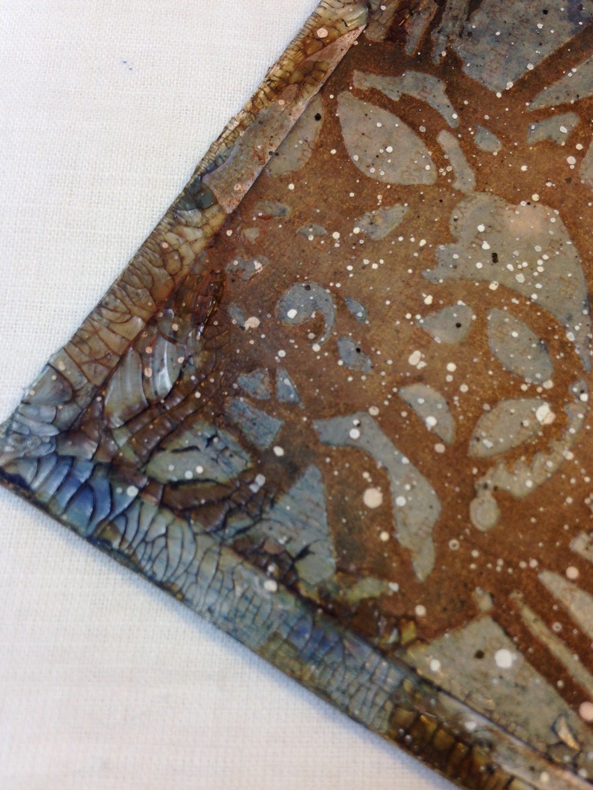
Of course, I was dying to work with my Distress Oxides some more, as they've been kind of sitting there teasing me, looking so pretty and organized on their specially devoted shelf in my Closet. I used them on my paper ruffles, my flowers, buttons,and my background papers. The bottom most layer is pink card stock from my stash. I mixed up soft gel medium with DOX in Worn Lipstick and applied through a Tim Holtz mini stencil. I also blended Vintage Photo DOX on, and some more Worn Lipstick. It really was too bright for my vintage look, so I mixed up a DecoArt white chalk paint with Faber Castell glaze and gave it a wash. I wiped it back so the raised areas would show.  The other pink background paper was a scrap I tested the gel/DOX concoction with first. It's a beautiful printed paper to start with, and really a shame to cover it up.

While I had that glaze/chalk paint mixed up, I splattered some on bunny image. It looks like some got on other things that were sitting on my work top, too.


These vintage buttons are from my vast collection, and I've painted them with the chalky paint and then swiped them ever so lightly with the Worn Lipstick DOX. I love the debossing on the one I've used for a center on my die cut flower (Tim Holtz Decorative Strip Flower Garland). I tinted my button thread with Peeled Paint Distress ink.

The four petaled fabric flowers are from a flower garland I picked up at a yard sale. (They are supposed to be hydrangeas.) When I brought the garland in so many months ago, my kitties fell in love, so on the floor it sits in a little circle. The carpet square in the middle is one of their areas they are allowed to scratch (we have 3 others throughout the house). The photo below is blurry, because Biskit was getting ready to jump- she was not up for a photo shoot today. The red ball is one of their toys, and they have tucked it into the "branches" of their little touch of outdoors. The blanket behind her is Roger's woobie (my other cat, for those that don't know); he drags it around the house with him. My cats are so neurotic!


 It's their favorite place to play, and when Biskit gets out of sorts (which she often does), she sits in her "fairy circle" to feel safe.  There are always a handful of these flower petals lying on the floor, so I pick them up and save them for crafting. I painted them with chalk paint and touches of Worn Lipstick.


The little mismatched Tattered Floral flower under the button is one I had in my stash--I believe it was colored with Worn Lipstick ink originally. I wet it so I could make some gentle creases in it, but I had Peeled Paint on my fingers from dying my thread, so it came out this funky color. Weird! Oops! Naturally, I had to make it look like a plan, so I made another for the opposite corner--barely visible in the photo above.


There's another delicate die cut from my friend Autumn (Tutti Designs, I believe) tucked under the flowers. Thank you, Autumn! Such a pretty addition to my card!


While all of my photos were taken outdoors on white fabric to catch the morning sun, I took this one just as the sun was coming up in the newly sprouting grasses right outside my front door. I love the Cross in this image, which is the real reason we celebrate Easter--He is Risen!

I am sharing this card with the following challenges:
Mixed Media Monthly Challenge #34-Buttons I felt rather cheesy using just one button on my last entry, so I had to dig deeper into my stash and use some more. Not easy, as I am a button hoarder!
Frilly and Funkie-You've Got to Know When to Fold "em" Well, lookie there! Perfect theme for my folded ruffles, creased paper flowers, lots of folding and creasing to distress my paper edges, and one single folded fabric (pure white) flower at the upper left, added at the last minute because it needed something. Kathy, were you reading my mind, or was I reading yours, when I started this a couple days ago?
Country View Challenges-March 2017-Inspired by Tim Holtz Even when I'm having a frilly moment, I'm still inspired by the King of Grunge! This time, by his products-new and old.

Thank you so much for visiting today and for all your lovely comments! They make my day!
Hugs and Blessings!
Sara Emily

Monday, March 13, 2017

Enjoy! Pink and Feminine Springtime Card

Hello friends and visitors! Welcome back! I took some much needed crafting time in the Closet, after serendipitously finding inspiration on the Internet last night.


 I'm laughing hysterically as I write this, because I read this morning on her blog that the same card that inspired  my friend Autumn of SewPaperPaint was the beautiful card by Audrey Pettit that inspired me! Last night I was looking for Tim's new Motivational stamps to see if I needed them, when I found Audrey's beautiful card. When I saw it, I just knew I had to use this coneflower by Tim Holtz on my card AND do a little sewing! So into the Closet I went for a little late night/early morning inky time!


This card came together quickly, as cards do. I embossed some watercolor paper with a yet unused embossing folder by Tim Holtz, swiped with Versamark to hit the high spots and heat embossed with some old Stampin' Up embossing powder. Out came the Worn Lipstick Distress Oxide for it's debut, and a hint of Vintage Photo Distress Oxide to give it some age. I think the thing that took the longest on this card was threading the needle of my sewing machine. Now I remember why I don't like to sew! But the results are worth it, don't you think? If anyone has a tip on threading that tiny hole, please let me know! I will in return send a month's worth of hugs or all my reader glasses and needle threading devices that don't help!


I really wanted to do my background in butterflies, but my only butterfly embossing folder or stencil has huge insects on it. So I chose this little strip folder also by Tim Holtz to make a belly band. I edged it with some lace I found on the road while taking a walk the other day.


The Tim Holtz flower is colored with Distress inks and markers, using my water pen and more colors were floated in the background. I stamped it once on the card, and again, on water color paper, painted it, then just like Autumn (The irony kills me! I think Autumn and I were twins separated at birth.), I stamped over it - the flower petals in Worn Lipstick, shifting it a bit on purpose to get more petals, and the seed head in Frayed Burlap, fussy cut it, and popped it off the card,  purposefully off setting it just a smidge so you can see the shadow of petals peeking out below.


The delightfully fluffy ribbon is a beautiful gift from my lovely friend Samra of Paper Talk With Samra. Thank you, Samra! Please be sure to visit her blog-she makes the most amazing elegant cards and is such an incredible inspiration to me! Of course I had to add a favorite vintage button from my collection, and died the button thread with Picked Raspberry stain.


These are the challenges I am participating in:

Mixed Media Monthly Challenge #34-"Buttons" Just the one, but added just for you!


Thank you for stopping in today and for all your wonderful comments! I read and appreciate each one, and really will eventually get back to visit you when my computer cooperates!
Hugs and Blessings!
Sara Emily


Monday, March 6, 2017

Mixed Media Art Journal Covers Guest Design for Happy Little Stampers

Welcome! Today I am designing as a Guest for Happy Little Stampers where the Mixed Media challenge is 'Books'. I have altered my art journal covers in some of my favorite colors with lots of texture. When you are done having a look, I hope you will hop over to Happy Little Stampers to see all the amazing projects the Design Team have created to inspire you!


I started by removing the book cover and back and giving both sides of the cover and backing 2 coats of gesso. I added the clock image in ink using a Tim Holtz stencil (Clockwork) using the monoprint technique I describe here


Next, I added DecoArt Crackle Paint through the same stencil on the cover and another Tim Holtz stencil  (Splotches) for the back cover and allowed that to dry overnight.


I made a puddle of  brown Distress paints and a little water on my craft mat and laid my cover in the diluted paint, removing and drying with my heat tool. I repeated this until I was happy with the result. I did the same thing with the back cover, but with blue paints. Some of the crackle popped off, and it really didn't look good on the back, so I added some Distress Crackle paint in Picket Fence to those areas, and allowed that to dry.


Not shown in photos in process, I went back in with Distress stains in blues and browns to achieve the final outcome on the front and back covers, and on the inside of the covers.  


I did some random stamping on the back cover using Distress Archival ink in Ground Espresso and Vintage Photo using portions of a Rubberstamps stamp and Tim Holtz Flights of Fancy and The Impossible sets. I also used my new  Prima Royal Menagerie clock stamp on a few of the crackled circles. 


I gave the front and back panels a coat of DecoArt Utra Matte varnish to seal, as these covers will be getting a lot of handling. I like the look of the chipping crackle, but I didn't want it to chip further.


Here are the inside panels. Please see my post here for steps on how I created these panels. On this book I've substituted designer paper for the manila folder I used on my card in my previous post, and you can see the faint print in the background. I've added some Distress Crazing Medium randomly around the edges and highlighted the cracks with Distress Crayons. There is some random stamping done with a Stampendous stamp and Archival ink.


For my collage on the front, I started with some vintage book pages  and a stamped image from Stampington and Company which I colored with Distress inks and stains. I distressed and splattered them with Distress paint in Black Soot. In between the layers I added Tim Holtz Mixed Media die cuts, painted to look like rusted iron.


I topped it with this metal frame which I also altered to look like rusted iron. This is from Prima's Junkyard Findings, a (new) gift I received from my uber talented and sweet and generous friend Autumn of Sew Paper Paint. I used an old 7 Gypsies rub on from my stash for the title, choosing just the right part of "The Juicy Part".


A Tim Holtz Gearhead Thinlit gets some rust using my yet unused Prima Artisan Powder--LOVE at first use! I guess I won't have to raid my spice cabinet for cinnamon any more!


Last, but not least, a little pocket watch I picked up at Hobby Lobby especially for this book. I rusted it as I did with the frame, and gave the face the crackle treatment.


It is Time to Make Art!


I wanted to thank Melissa and the entire Design Team at Happy Little Stampers for inviting me to create with them today! It was so much fun putting this little book together, and now it's ready to fill with art!


Thank you for stopping by today and for all your lovely comments!
Hugs and Blessings!
Sara Emily